GET COZY
E-Commerce site for SugarBoo&Co
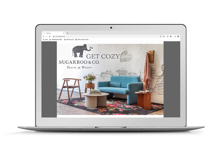
SugarBoo&Co is an independently-owned retailer in Metro Atlanta that exists to bridge the gap between the maker and the consumer. They promote handmade gifts, wall art, and home accessories & decor.
Their products are reminiscent of family, nature, wildlife, timeworn artifacts, children’s art & folkart. They love to juxtapose old & new, light & dark, intensity & whimsicality.
My line, GET COZY, is a specialty line of furniture produced at SugarBoo&Co’s Ponce City Market location, that encapsulates all of those unique and wonderful features. GET COZY needed a microsite to build brand recognition and attract high-end customers.
Strategy
Project Goals
Brand Vision
Discovery
Competitive Analysis
Card Sorting
Analysis
Problem Statement
Solution Statement
Persona Creation
User Flow
Design
Site Map
Sketching
Lo-fi wireframing
Clickable prototyping
Usability Testing
Production
Prototyping
Usability Testing
The Problem
The GetCozy needs a microsite to build brand recognition and to attract high-end customers for their one-of-a-kind products, which are not currently featured on SugarBo&Co’s home site.
Solution
The GetCozy microsite will feature a minimalistic design to keep users’ focus on GetCozy’s unique products, while intuitive navigation will lead them towards a smooth check out. Engaging product images and robust feature descriptions will help users become familiar with the SugarBoo&Co brand.
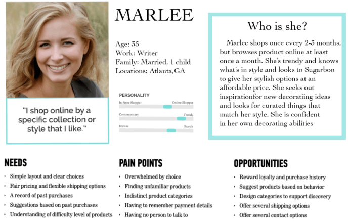
understanding the user:
I began my process by creating a persona that embodied GetCozy’s target user - she is trendy, a writer, and loves shopping.
MARLEE'S STORY: Marlee is a writer and spends a lot of time at home with family and friends. And for her, it is essential to make her place cozy, stylish and practical. Marlee needs a simple, clear way to find a sofa for her living room because she wants to organize a book club meetup and make the living room the comfiest place in the house.
The development of this microsite GET COZY will help Marlee easily and quickly find and buy a sofa that will make her room beautiful and elegant, and make a meeting successful.
understanding the other guys:
My next step was to conduct a Competitive analysis The most important takeaway from this analysis was learning how different websites organized their home decor selection and the overall layouts they used for those websites per industry stundards. I saw all the functions that are not on SugarBoo&Co site I put them in a black circle and improved them in this project.
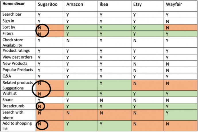
Comparing different features
The primary business goals of GetCozy microsite:
- Simple layout and clear choice.
- A record of past purchases.
- Suggestions based on previous purchases.
- Having no person to talk.
- Ability to support a single page for each product
synthesis:
Based on my findings and GetCozy’s business goals, I prioritized “must-have” features
- Our story
- Contact us
- List of furnitures
- Sort by price
- Check out
- Related product suggestions
- View order
- Buy again
- Wishlist
- Breadcrumb
- Shopping list
determining site structure:
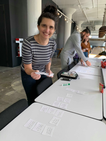
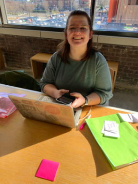
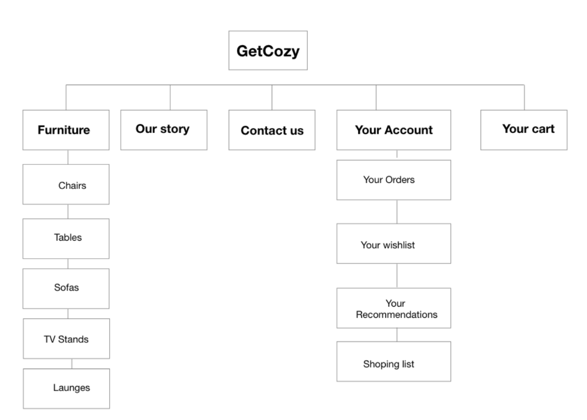
I conducted card sorting exercises with 7 users to determine a site structure that would be intuitive and efficient.

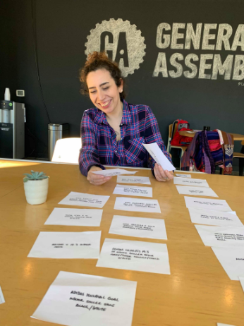
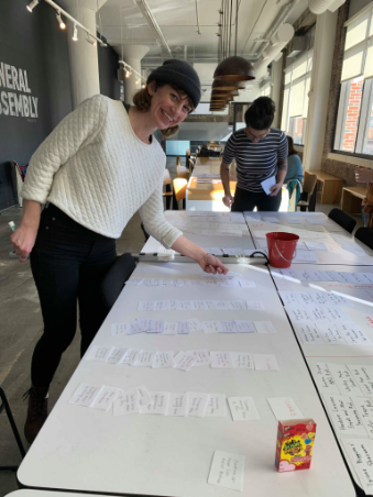
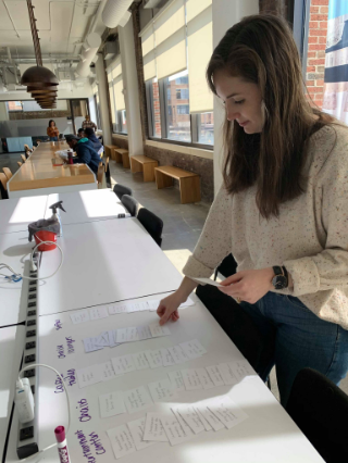
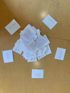
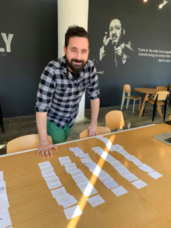
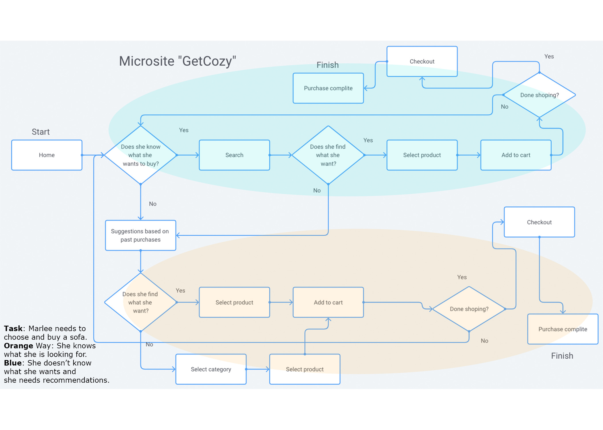
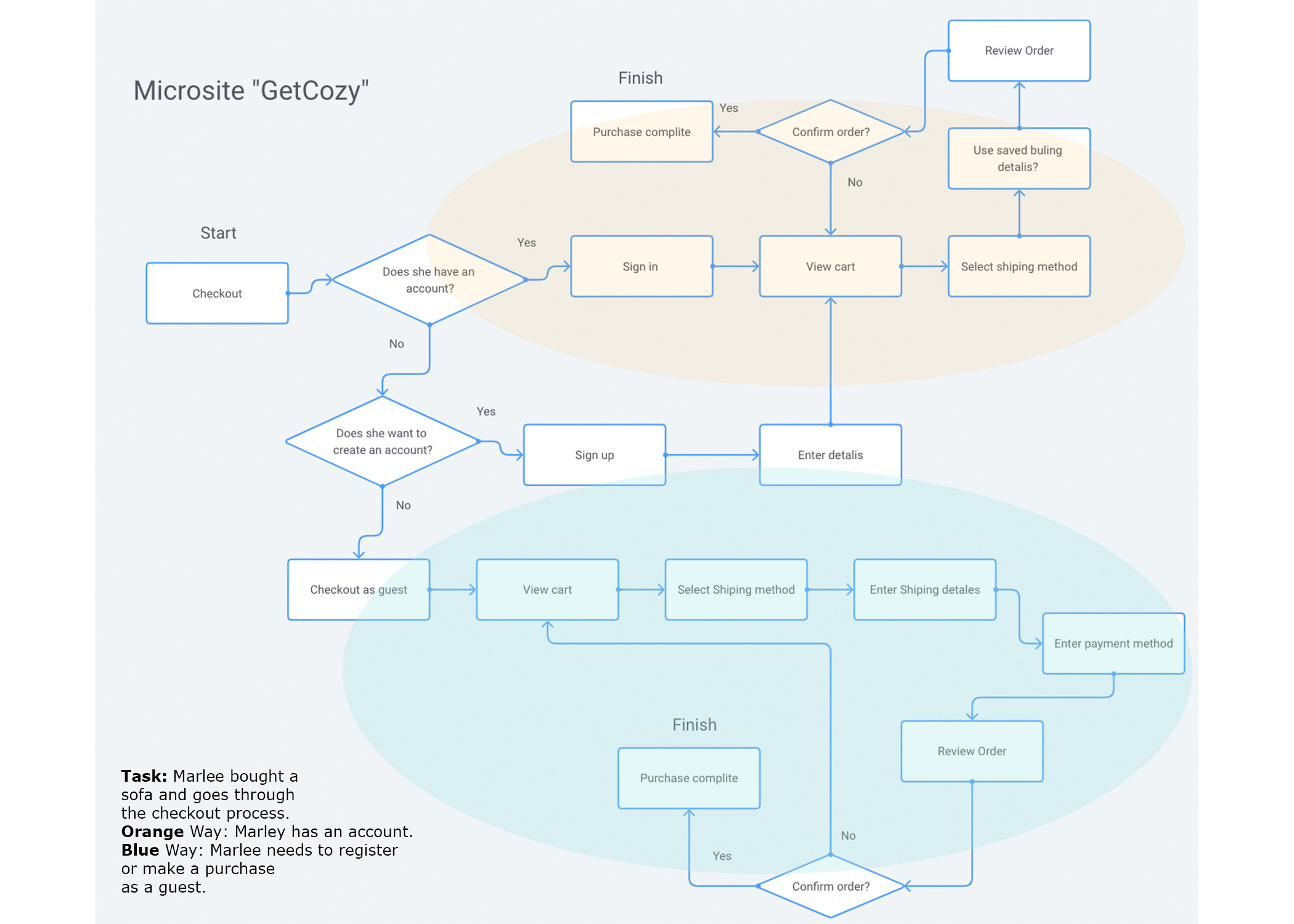
A collection of the pages on my microsite
refining design direction:
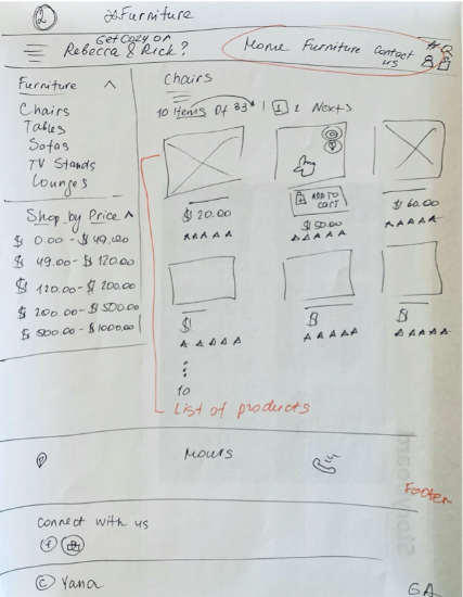
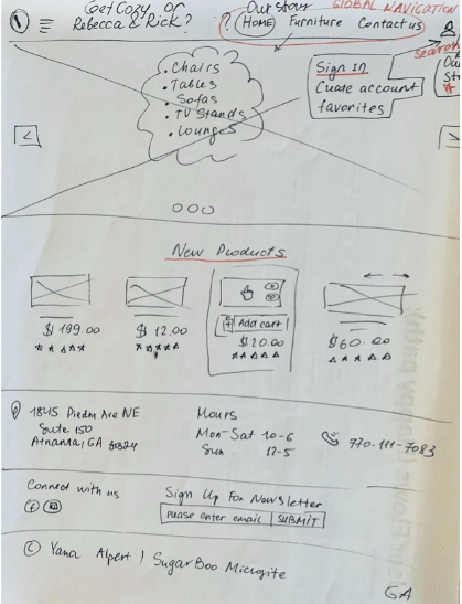
With a site structure in mind, I put pen to paper and sketched an initial set of wireframes that would inform the rest of my design. I refined my sketches based on feedback and some quick paper prototyping.
first sketches
Home Page
Product category page
annotated wireframes
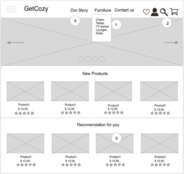
Home Page
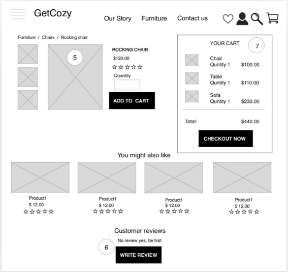
Product page
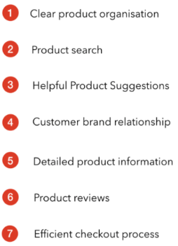
After a few iterations, I finalized wireframes for the following flows:
- Landing page / featured products
- Product search and detail page
- Checkout flow and order confirmation
- View Recomendation / shopping list checkout
- View order / Buy again
First prototype
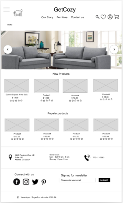
Home Page
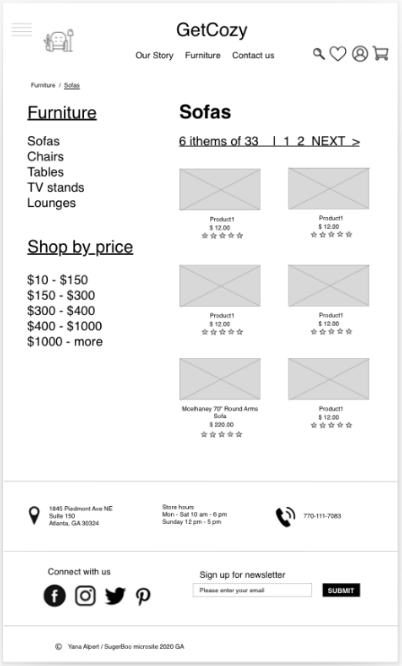
Product category page
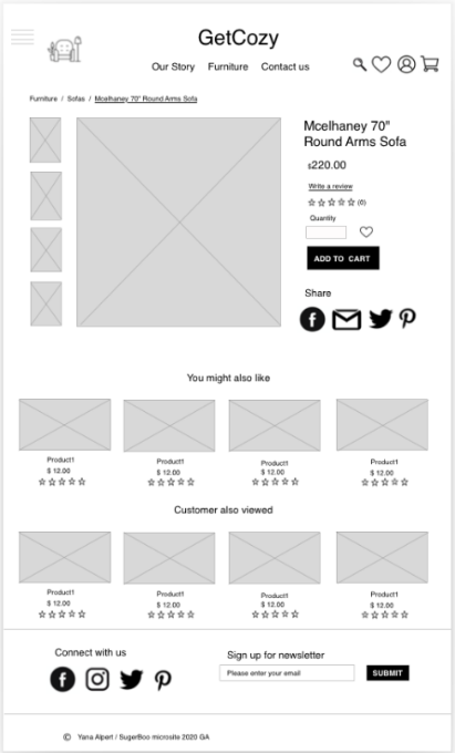
Product page
usability test findings: iteration 1
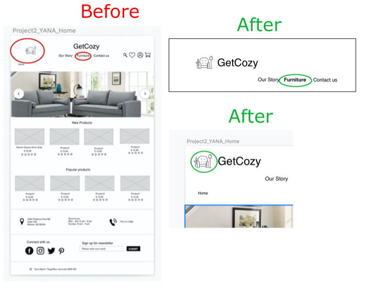
After usability testing I found that on the home page I have two types of menus and users found this unnecessary, so at the next step I simplified this
I made so that when you go to the page, the menu name is highlighted more bold. This will ensure that the system responds to user actions.
usability test findings: iteration 2
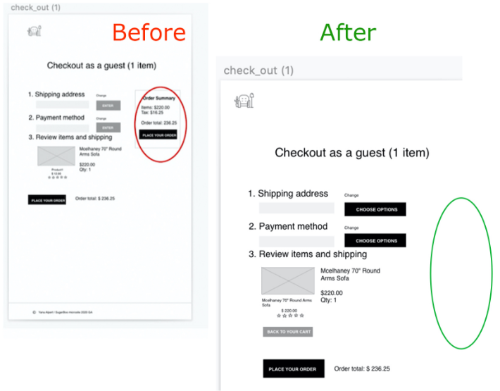
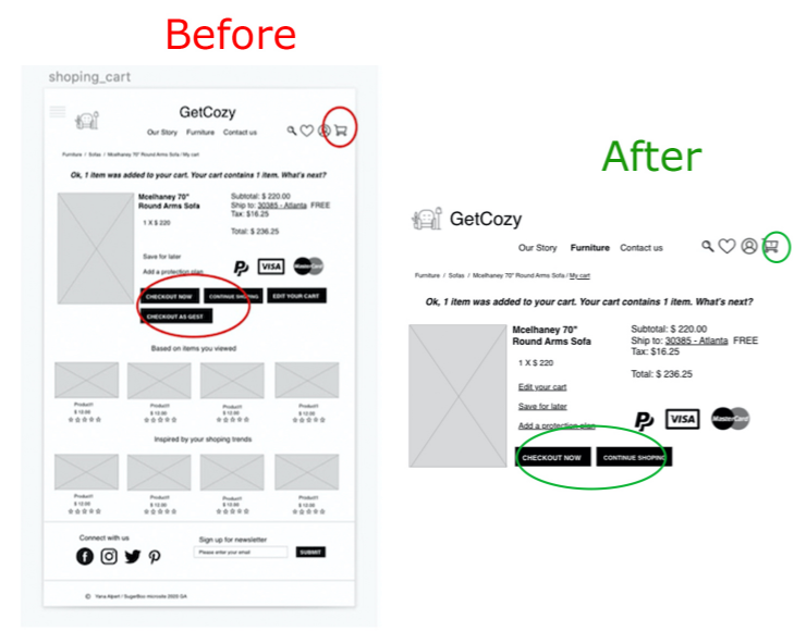
I redesign the check out process, users said it was a lot of buttons, they were confused, I moved to another dialog page sing in/sing up or check out as a guest.
usability test findings: iteration 3
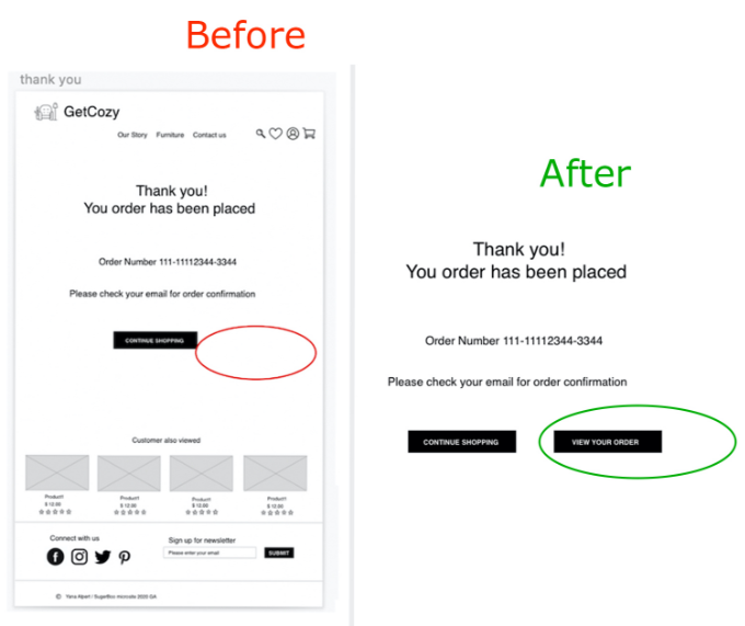
Users said they would like to view order information and I added this button in next iteration.
usability test findings: iteration 4
I also made it possible to display the icon, where I indicated, the amount of furniture in the basket.
During the next usability testing, users noticed that the fast check out process is not relevant for users when they bought furniture as a guest, so and I simplified this page and added the button “Back to your card”.
- Development of a shopping list, wishlist and search in more details
- Create Journey map
- New usability testing and analysis
- High fidelity prototype development
- Show that the site can be accessed from the main SugarBoo&Co site
- Make it responsive
If you want to hear more about this project, feel free to contact me.
Thank you!
My Projects
Showcase of my recent work
