PIEDMONT SOCIAL
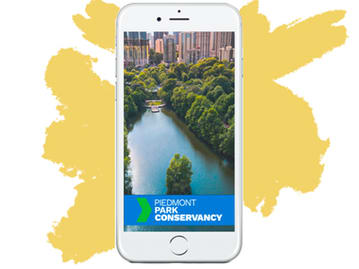
Reinventing the Digital Presence of Piedmont Park Conservancy
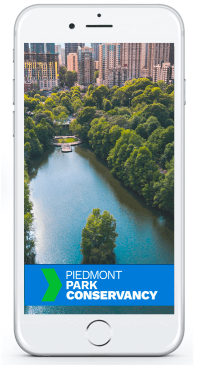
Our team was tasked with an assignment to design a concept that would help The Piedmont Park Conservancy bring in more people and increase memberships, donations, reservations fields online. We were given two weeks to design and test this concept and present it to an audience.
The Piedmont Park Conservancy is a member and donor-funded nonprofit organization working in partnership with the city of Atlanta to ensure Piedmont Park is an iconic park for all neighborhoods of metro Atlanta.
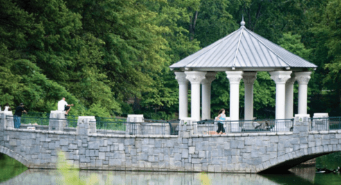
Piedmont Park is over 200 acres and attracts more than 4 million visitors each year, and is much too large for just city taxes. That’s where the Piedmont Park Conservancy comes in. Not only does the Conservancy contribute over $3.5 million each year into the maintenance and enhancement of the Park, but also brings the Park to life through a variety of programs such as Green Market, recreational and fitness activities, youth environmental education and special events.
EXPAND OFFERINGS
To build a wider range of activities + facilities offered
SAFETY
To ensure a safe, clean, green, + accessible to all
BUILD COMMUNITY
Grow active community of supporters, neighbors, users, and stakeholders
EXPANSION
Beltline Integration + build more user accessible facilities
Challenge
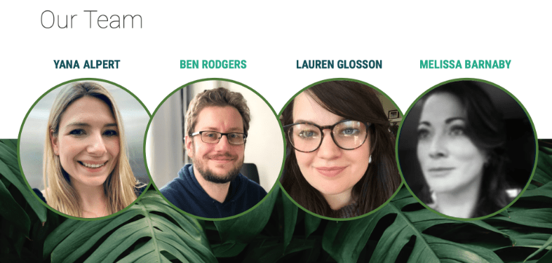
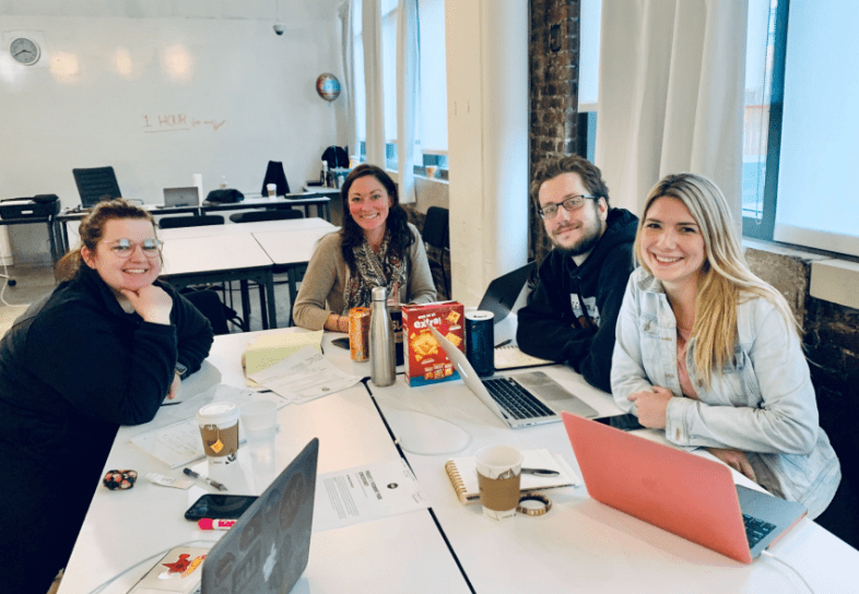
In two weeks, collaborate with team of 3 other UX designers to create a better digital experience for The Piedmont Park Conservancy visitors. To do so we went through the process above, all while keeping the client and users in mind.
Problem
The Piedmont Park Conservancy visitors need a way to easily make reservations fields and courts, create events, share this events with their friends, better navigation and make donations.
Solution
We will be creating an app with helpful navigational tools, an event board, and user-managed invitations. The result this intuitive digital experience should allow the Piedmont Park Conservancy to engage the community, increase park traffic, and raise membership in order to increase donations.
DISCOVER Research
DEFINE Synthesize
DEVELOP Design
DELIVER
Test
Iterate
Repeat
Screener Survey
Who are our users?
Surveyed 52 people
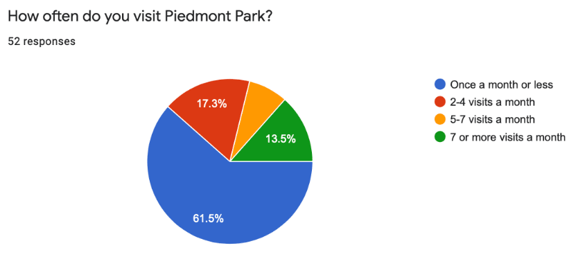
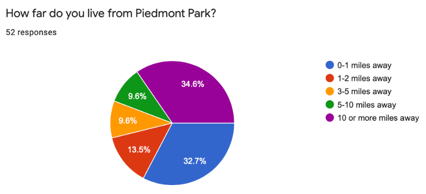
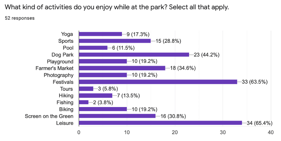
- We noticed a large percentage of respondents are not members and have never made a donation. Also people live either very close or very very far and go to the park once a month or less.
- We decided to choose from those people who were most familiar with the Piedmont Park Conservancy as our user interviewees.
7 non-members who go to Piedmont Park once a month or less with the most diversity, ranging in age 25-40. We created a script making sure we asked Who What When Where Why and How in an unbiased way. Also made sure not to mention an app, since the gardens had only a website
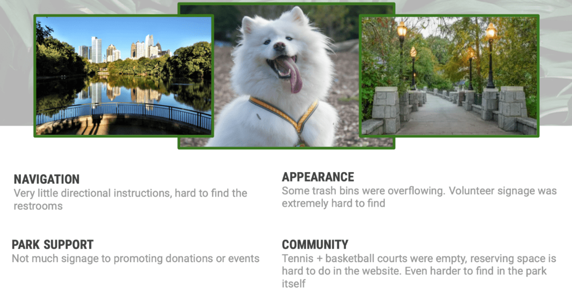
On grounds
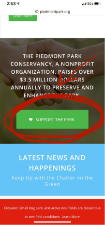
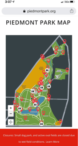
Also we saw the sign “Support the Park” on the field in the Park, we ask people to explore how to make a donation on the site through the phone and found that a button of “Support the Park” was at the end of the web page and it was hard to find. We asked people about navigations, they rarely used the site, and we noticed that it was hard for them to find something on the Piedmont park map because the map does not show your location.
affinity mapping
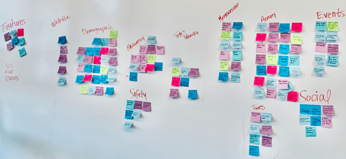
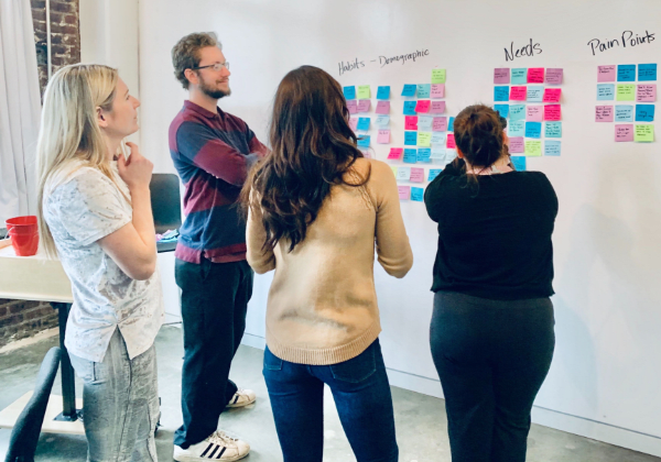
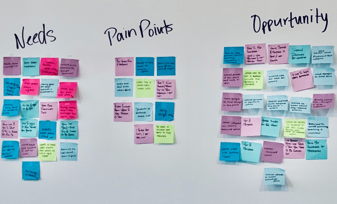
The categories we came to seemed endless...
- Time & Parking
- Membership
- Activity
- Tours
- Events
- Social
- Features
- Website
- Demographic
- Navigation
- Safety
- People feel safe in the park, but would like to be able to report a problem if they see one during a walk.
- They are active and would like to know more information about events in the park.
- We found a lot of overlaps between the categories “pain points” and “needs” and “opportunities” that we created while synthesizing.
Minimum Viable Product
- Events
- Navigation
- Reservation the areas
- Support the Park
From Website to App
Because users wanted real-time information about event, easy navigations, donations, our solution for these physical problems needed to be mobile.
persona
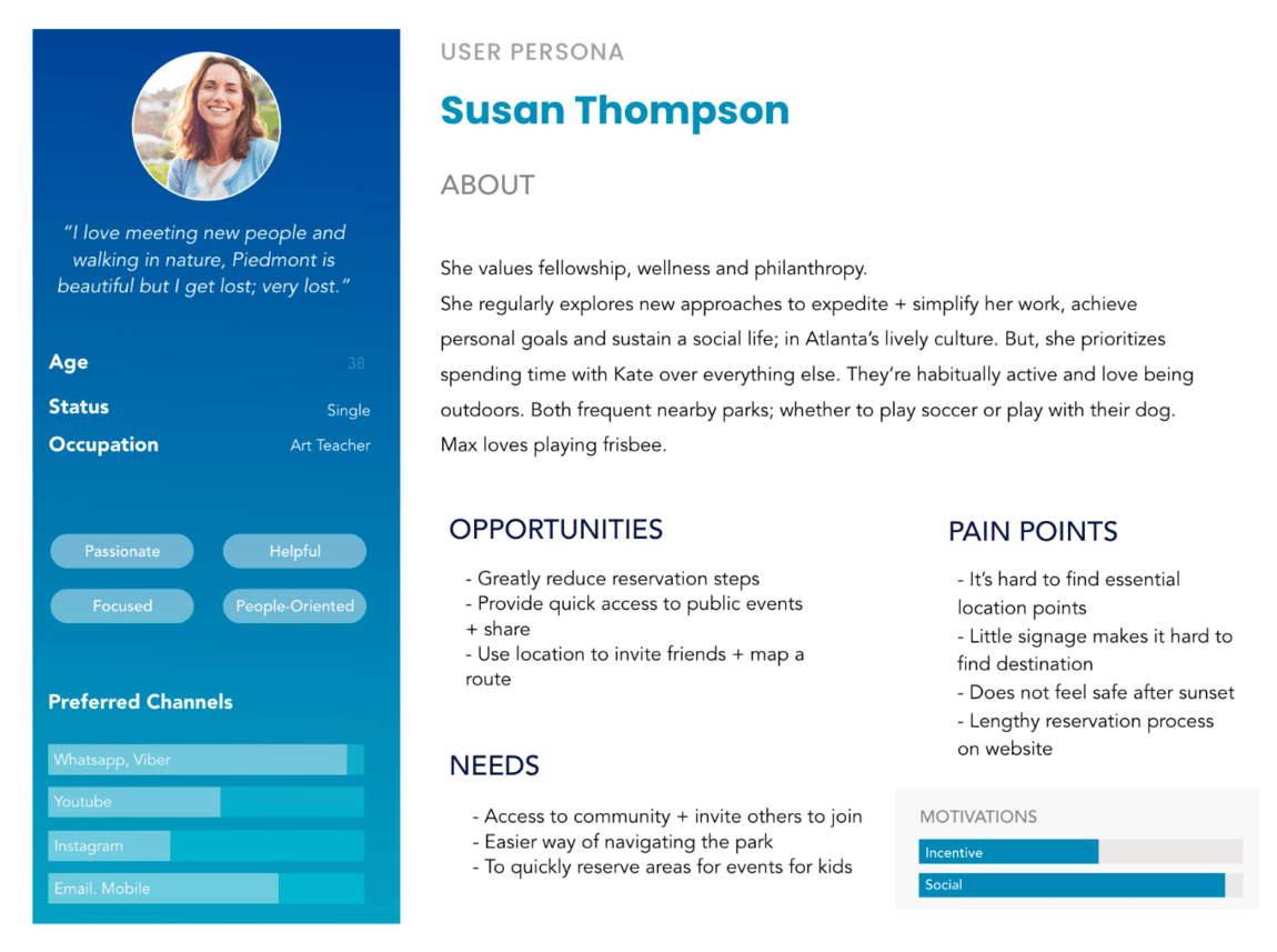
SO… WHAT’S THE PROBLEM?
Susan needs a clearly, easy and a fast way to make soccer field reservation for her daughter 6 Birthday party, share this invitation to her friends, share locations and inspire people to make more donations for our Park because before she tried to do this using the Piedmont Park site and was very disappointed in trying to achieve this.
SOLUTION
I believe that the development of this App will help Susan fast find and make a field reservation that will make her daughter happy, and make a birthday party successful.
And exactly creating a mobile application will make donations a prioritized function, and using navigation in Park is easier.
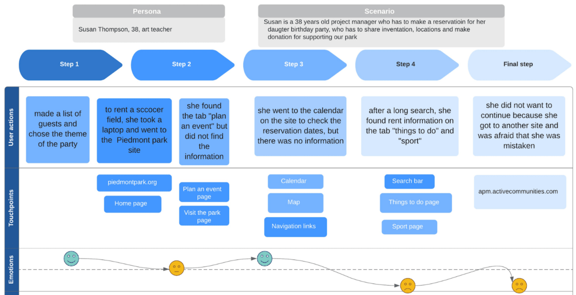
OVERAL SATISFACTION RATED 1-10 : “4”
By providing visitors with an intuitive digital experience, we solved for their physical needs, such as reserving the fields, create events and share it with friends, navigation, donations.
Testing Existing System - Reserving a Bocce Court
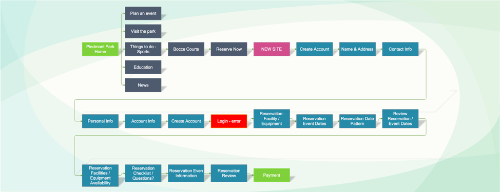
We saw how many steps it takes to make a field reservation at the moment on the Piedmont park site, but we created an application that reduced the number of these steps to 5.
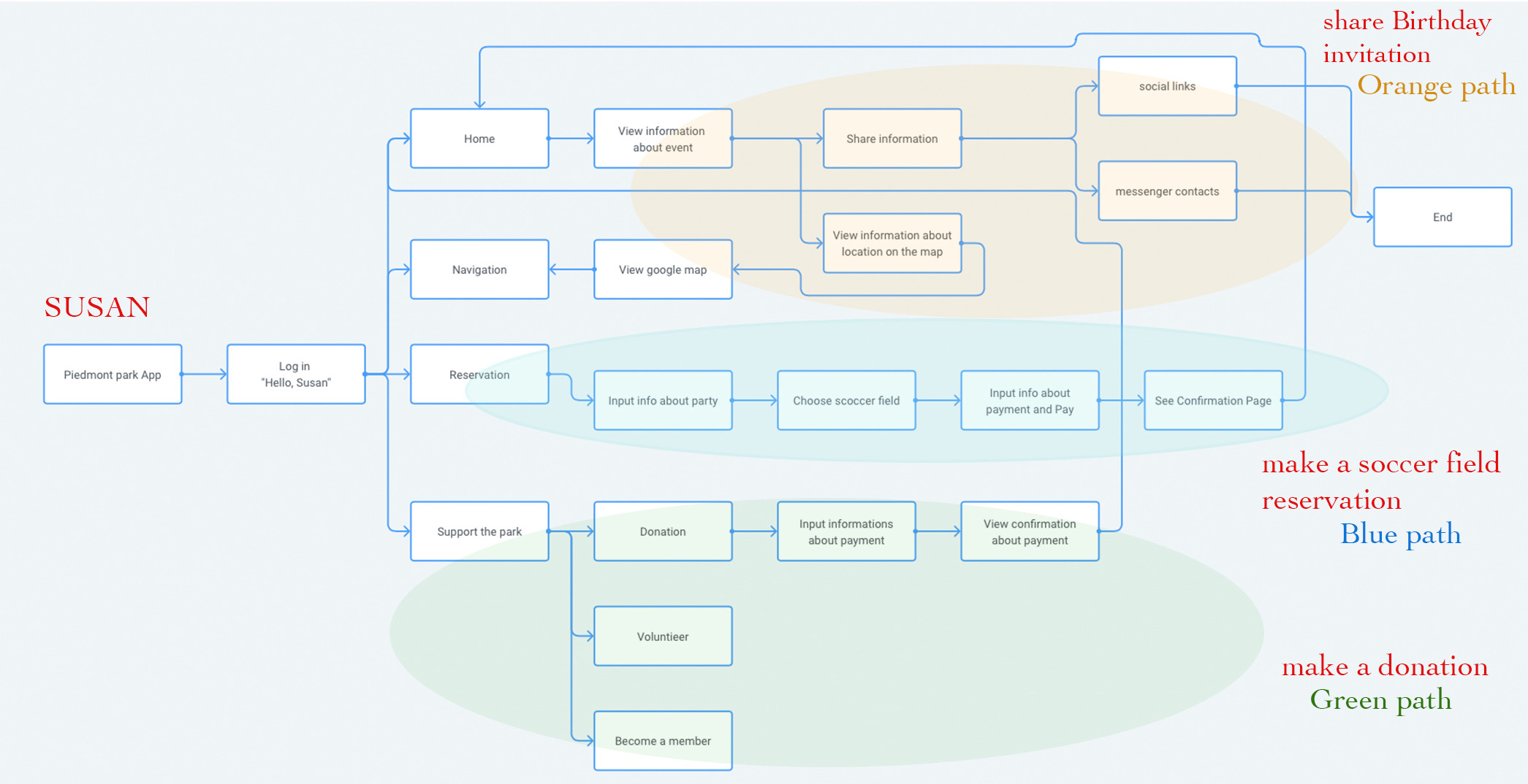
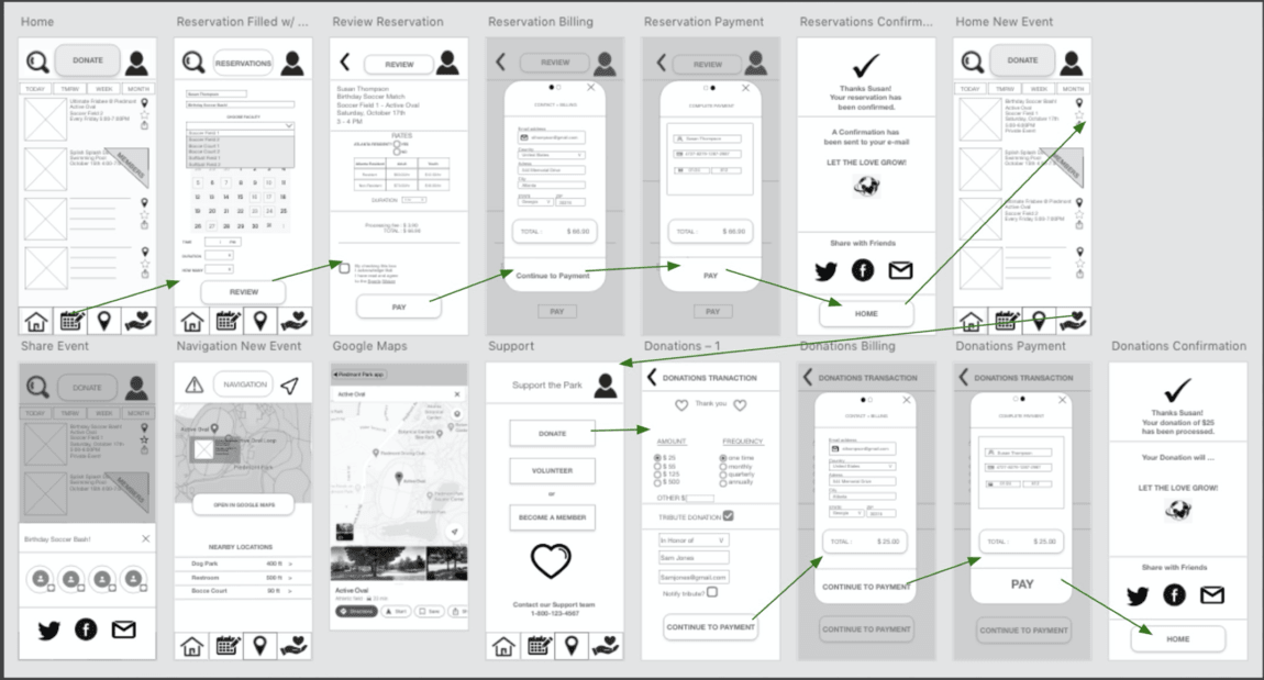
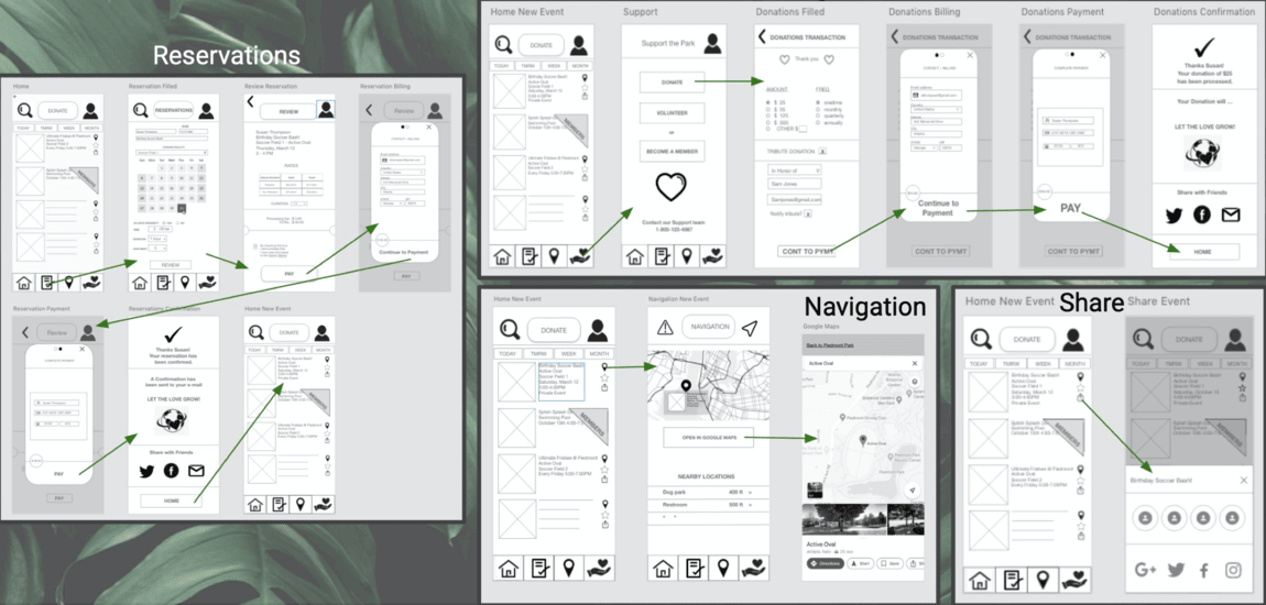
On this picture you see a general view of the user flow of our application. We designed it to create an intuitive interface.
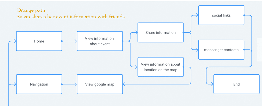
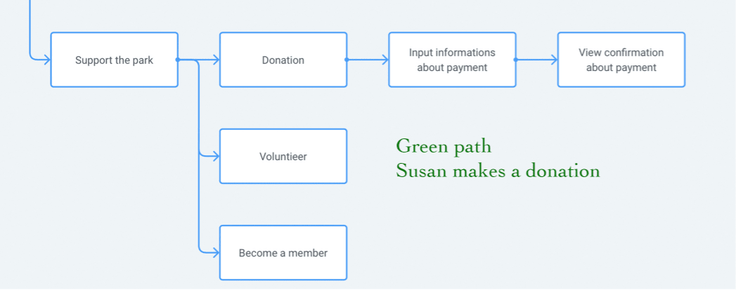
Our person has the task and for a better understanding, I laid it out in three ways. This is a field reservation, share this event with friends and make a donation On the following slides you can see the steps in more detail.
User flow for mobile application
Reservation soccer field for birthday party

Share informations about party and see locations on the map
Donation
1st design studio, figuring out what features to offer
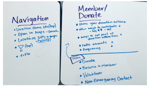
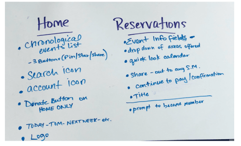
Sketches
We used method “Crazy 8” for each page to find the best solution.
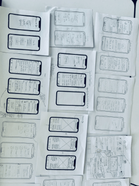
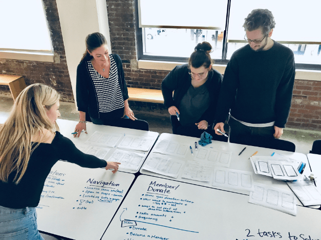
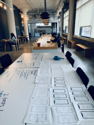
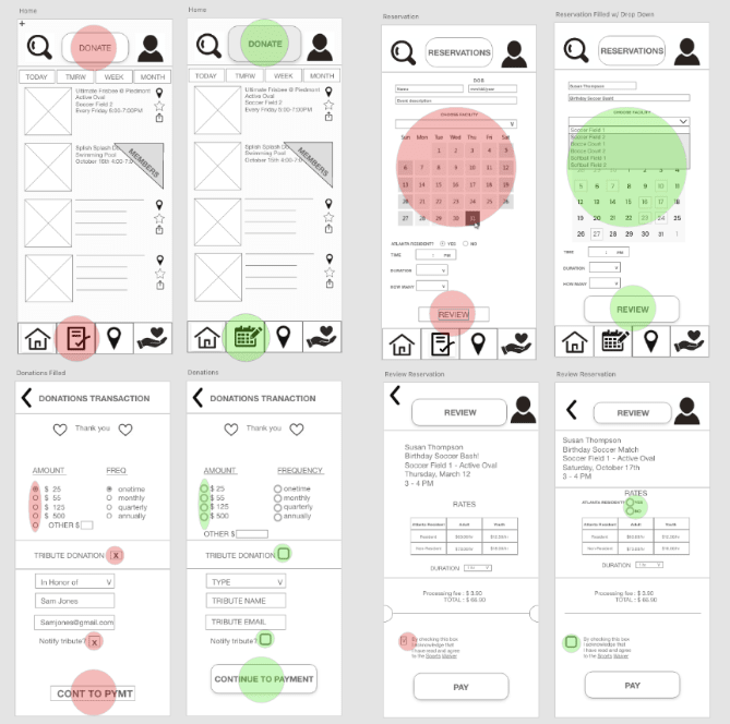
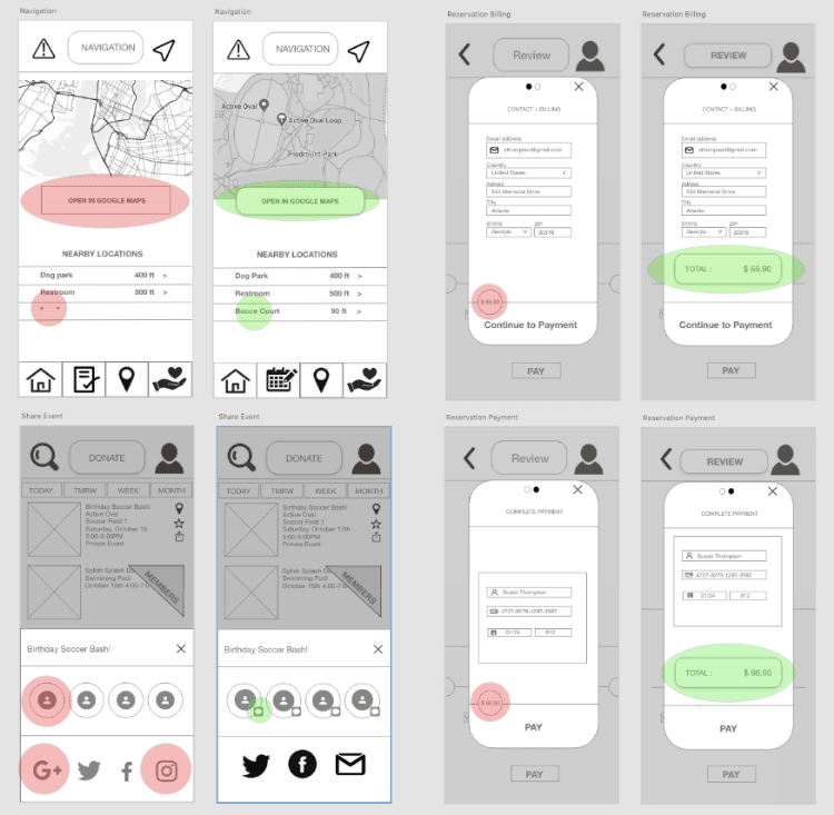
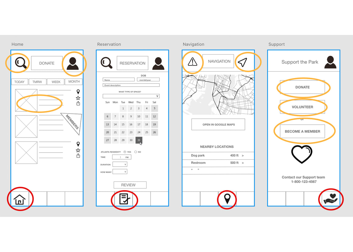
After understanding our users and prioritizing features, I developed a series of annotated lo-fi wireframes to provide direction for the next steps of the project. I worked in Adobe XD in order to collaborate on any page at the same time with my team.

ANNOTATED WIREFRAMES
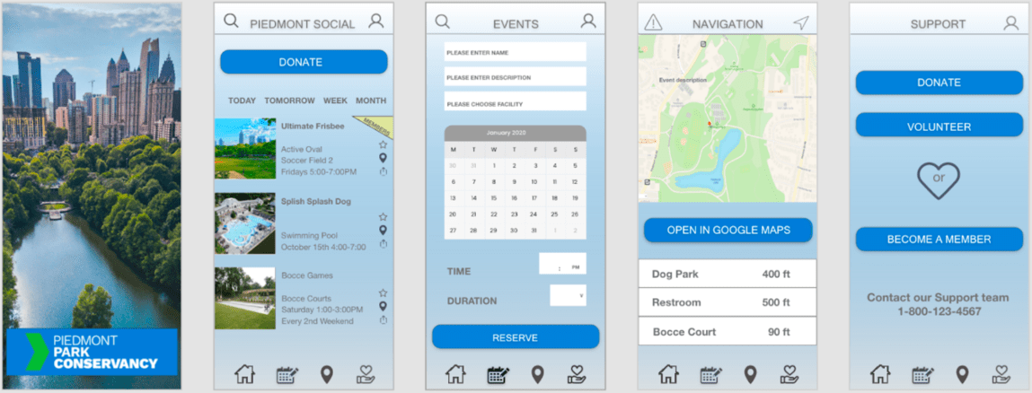
FIRST PROTOTYPE
FINAL PROTOTYPE
JOURNEY MAP: AFTER
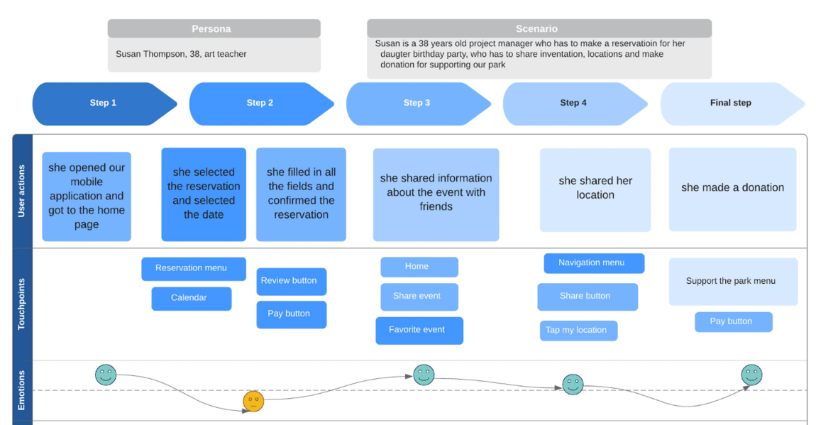
We used this journey map to illustrate the experience of a user and to identify key touch points for our app.
OVERALL SATISFACTION RATED 1-10 : “8”
What’s Next for Piedmont Social?
- Align with business to identify strategy moving forward (we are aware where they are headed so the app can account for their vision)
- Pair with development team to understand technical feasibility of solution
- Continue to test and refine prototype - A/B testing to confirm visual design choices
- Send to development
- Potential feature add:
- Create a fully functional map
- Implement data analytics
- Consider adding a digital permit page
If you want to hear more about this project, feel free to contact me.
Thank you!
My Projects
Showcase of my recent work
