One Spring
Redesign site for UX agency

Yana

Tori

Thomas

Morgan
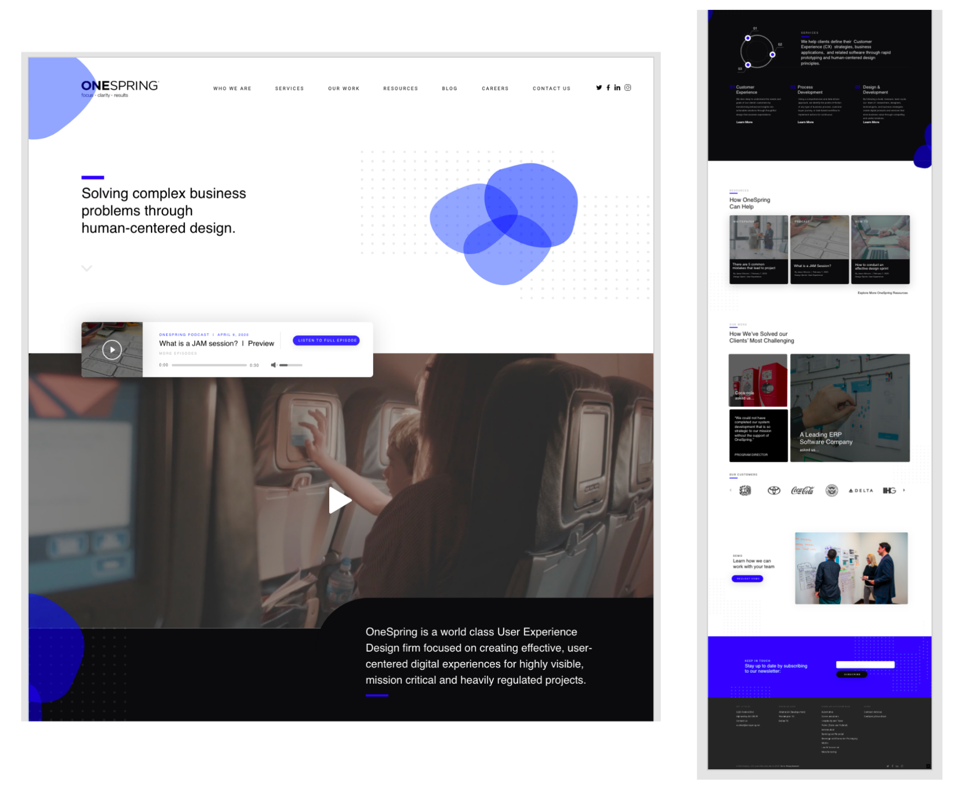
Our team was tasked with an assignment by using the UX design process to provide a fresh perspective on how to improve the existing OneSpring website that would help OneSpring to increase engagement for prospective clients by providing dynamic content, clear voice, thought leadership, and a cohesive thoughtful digital experience. We were given three weeks to design, test this our concept and present it to an audience.

Project Planning

Research and Analysis

User Tasks
Usability Testing
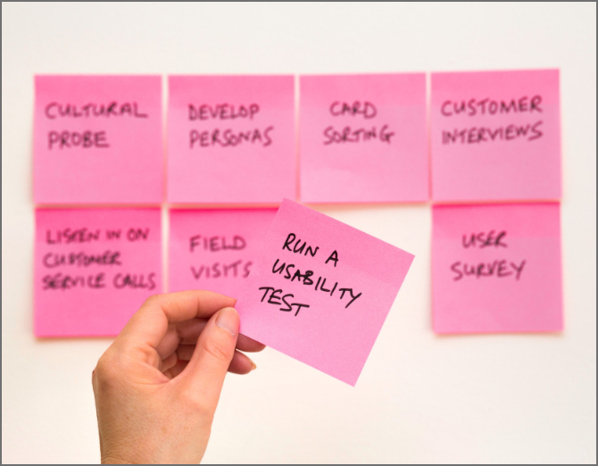
For this project, we followed the UX Design Process of research, synthesis, design, and iteration.
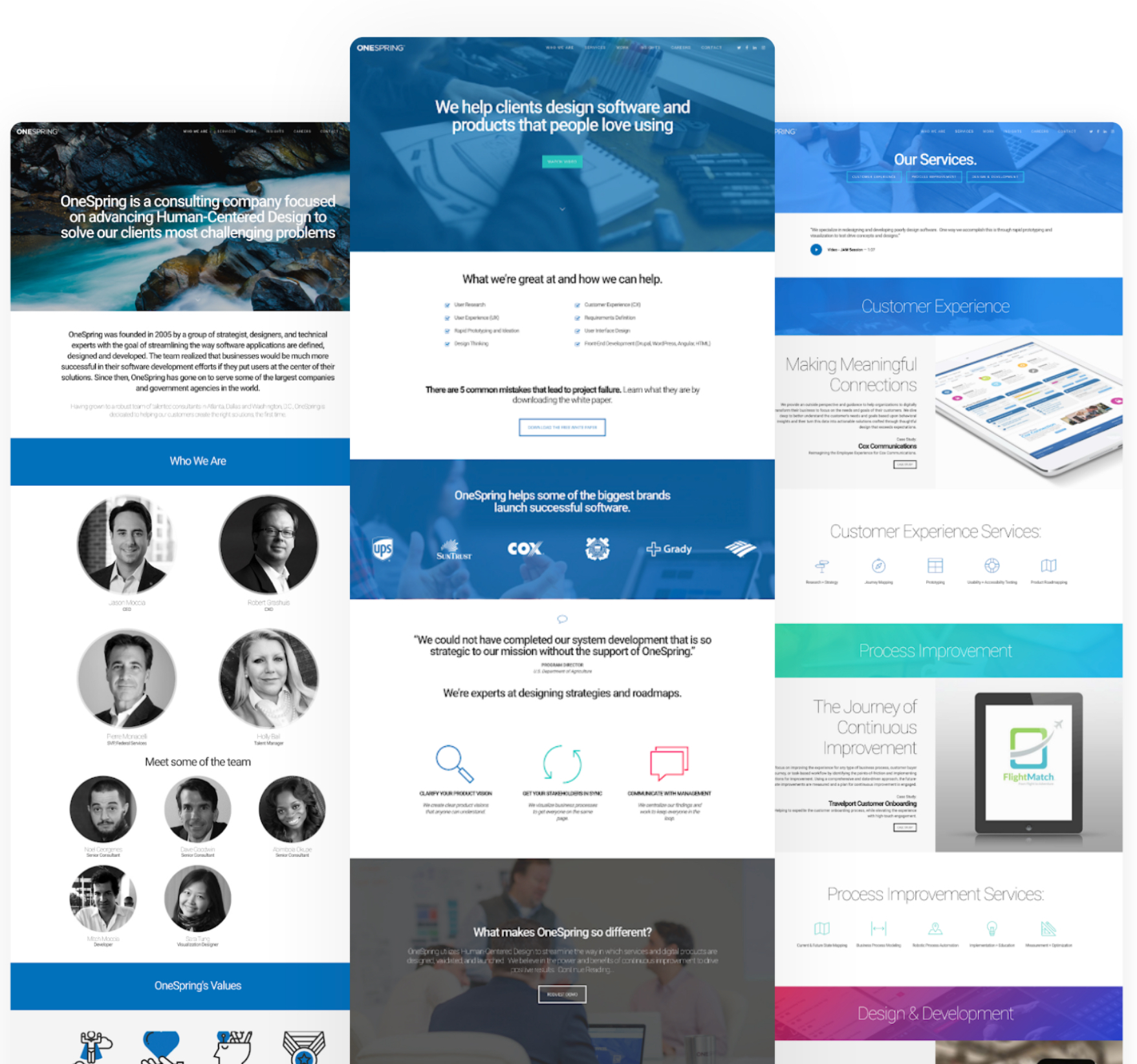
OneSpring is an experience design firm that specializes in defining, designing, and developing digital strategies and software applications.
“At OneSpring, we truly believe that software has the ability to directly impact our world and daily lives in meaningful ways. We are committed to making a positive impact on the world by helping individuals, corporations and government agencies create the most elevated software experiences in highly-effective and efficient ways.”
Beginning our user research
Early on in the project we found out that we would not have access to OneSpring’s users for interviews or testing.
What did we do?
- Surveys
- First impression tests
- Interviewed other Designers
Data from Surveys
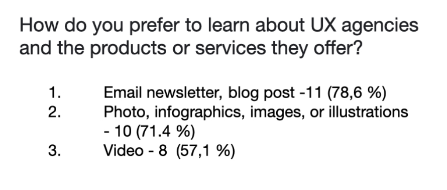
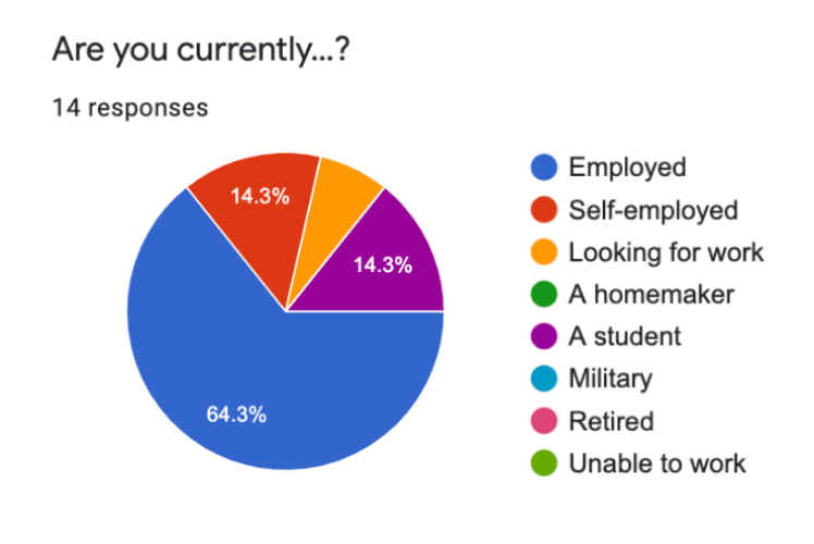
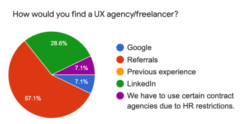
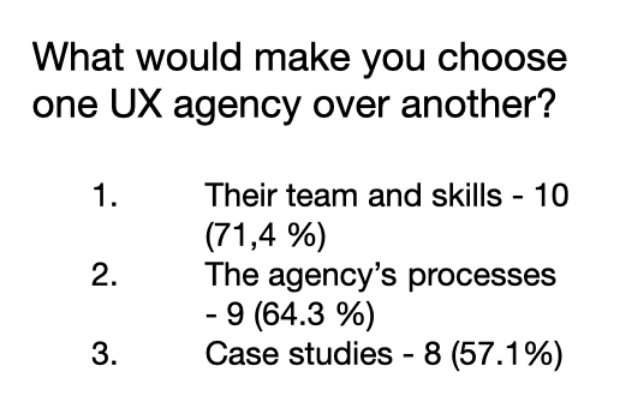
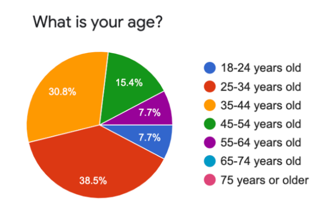
We got 14 responses
And that is what we found:
- Most of our users are people from 25 to 34 years old, or 75 and older
- Most of them are employed and use desktop computer for viewing sites
- The most important qualities of the company for our users are: their team and skills, the agency’s processes, case studies
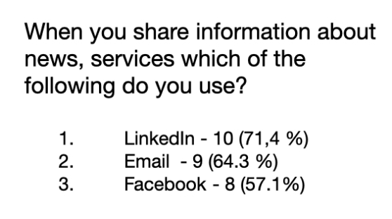
- When our users share information about the news, services, they most often use LinkedIn, Email, Facebook
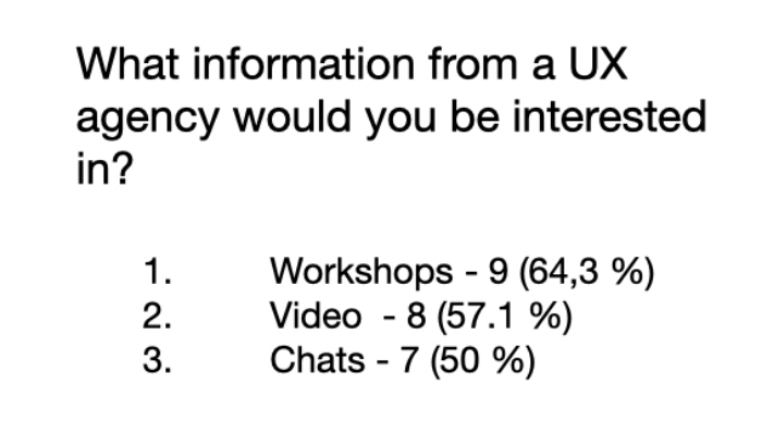
- Our potential users are interested in workshop, video, chats
We Interviewed
- Regional Sales Manager: B2B
- VP, Enterprise Solutions
- 3 front end developers
- 5 UX designers
We asked
- Lifestyle / introductory questions and Website-specific questions
- For example:
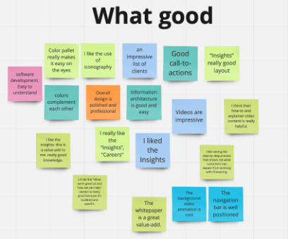
- What did you like most about the website?
- What did you like least?
- How could the website be improved?
We identified patterns
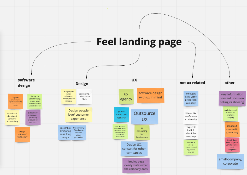
We asked 23 people to take a first impression test in which users looked at the site for 15 seconds, then answered this set of questions and we counted the most frequently used words.
3 words that people remembered from the site
- Design - 10
- Software - 5
- Research - 3
- Consulting - 2
- Services - 2
What is this site about?
- Company - 9
- Software - 7
- Design - 6
- Consulting - 4
What services are offered on this site, and for whom?
- Design - 8
- UX - 8
- Software - 7
- Development - 4
What is the feel of this site?
- Professional - 12
- Small - 4
- Corporate - 3
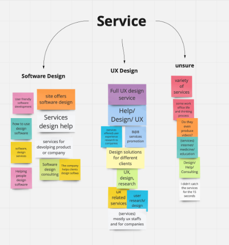
The main conclusions after conducting these tests, we wanted to note that people understood the type of company, landing page works well, they liked the style and color scheme, but they did not understand what kind of services and for whom the agency provides them.
Affinity mapping
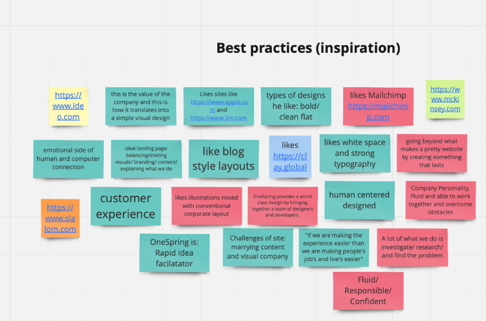
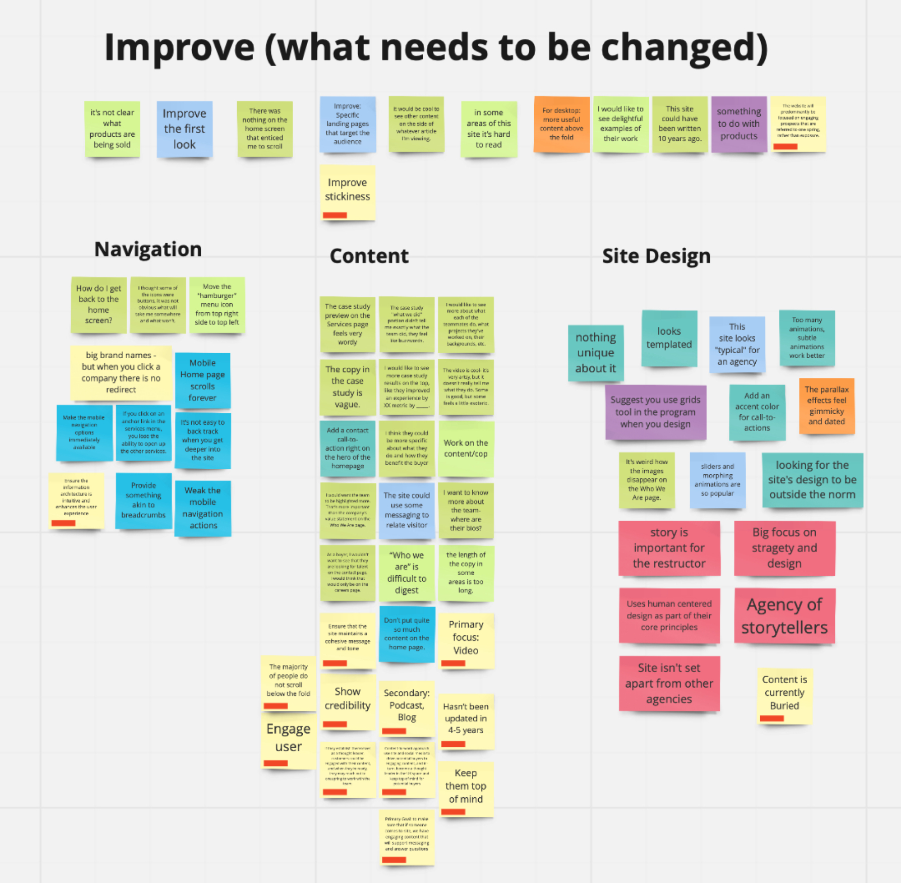
After we collected so much data, we used affinity mapping to organize all the ideas. Here you can see opportunities, pain points and needs that we identify
Opportunities:
- Reorganize content on “Who We Are” and “Services” pages
- Work with “Call To Action” on Home page
- Work with case studies, blog, and articles
Pain points:
- Some pages contain a lot of text, which is difficult to read.
- Because the site contains few photos, users do not feel an emotional connection with the site.
Needs:
- Users need better navigation.
- Users need pages with content that’s easier to digest.
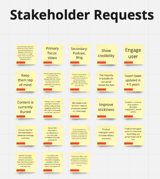
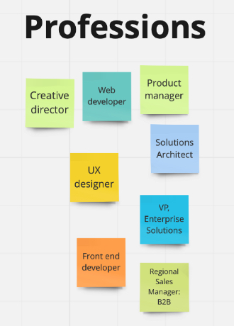
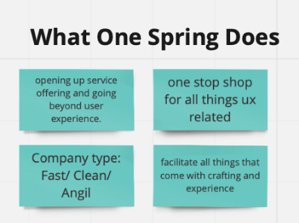
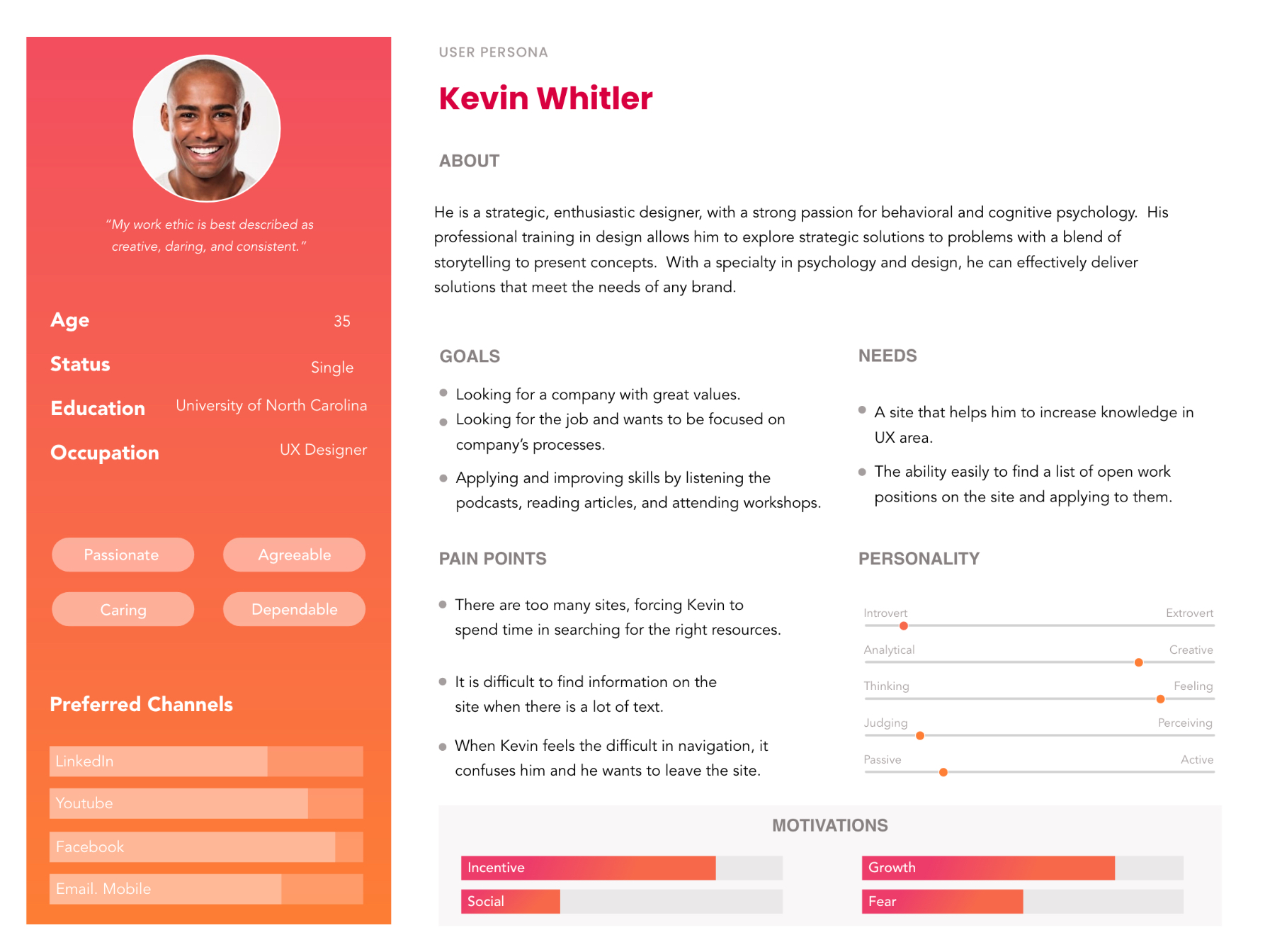
To represent a user type that might use a site in a similar way we try to created two types of personas.
The first group of users are people who are looking for job or useful information to develop their skills in UX. People who want to be hired by OneSpring and they offer their skill to OneSpring
The second group of users are business people who are looking for a reliable company for cooperation, who wants to hire OneSpring to do work, potential customers
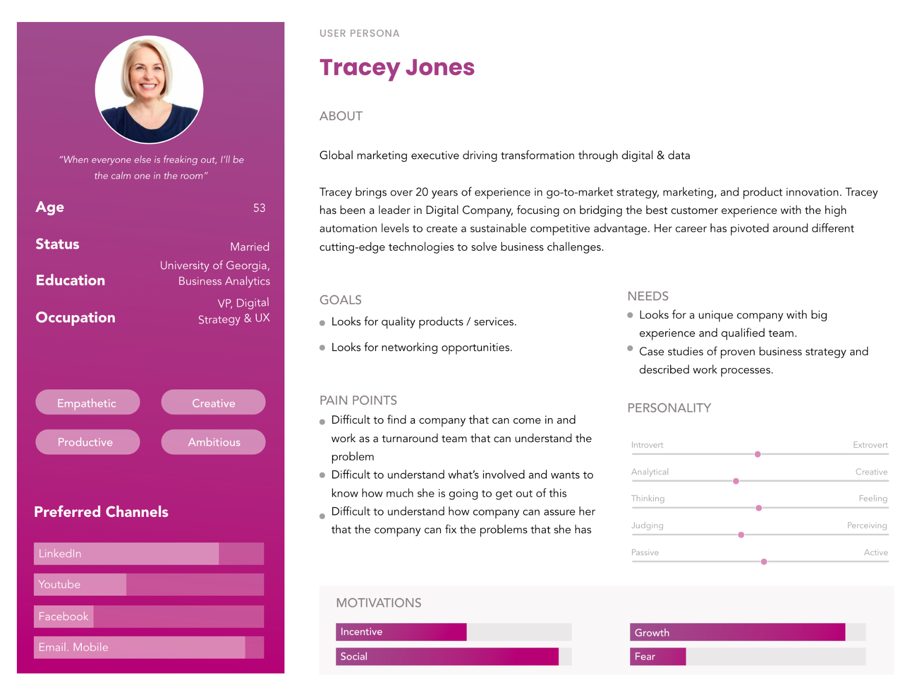
After synthesizing our research, we discovered there was not enough information to create a COMPLETE persona for OneSpring’s ideal clients.
This is what we learned from the partial personas we were able to create:
- It is important to let the user know what the OneSpring is clearly at the beginning of the landing page.
- A minimalist page layout is easy to navigate.
- OneSpring’s message and tone was not being communicated clearly on the website.
Jobs to be done is a theory for understanding what motivates customers to buy your product.
Why this worked better
Able to consider stakeholders and users wants together.
Helps us empathize with user’s problems then design to solve for them.
Maps out the user’s experiences and motivations before coming to OneSpring’s site.


OneSpring’s potential client looks for a unique and recognizable brand. They need a site with easy navigation and readable content, where they can find articles, blog posts, and podcasts. Clients want to view examples of work and contact OneSpring about future design services.
The redesign of the site will increase the recognition of the company and increase brand confidence through a better presentation of works and clients. In addition, better navigation will allow the introduction of new content such as podcasts and webinars which will attract new users.
Determining the structure & layout of the homepage to improve engagement & content exposure
Moving forward to solve our problem we conducted card sorting activities and competitive analysis to design a site map and improve the global navigation.
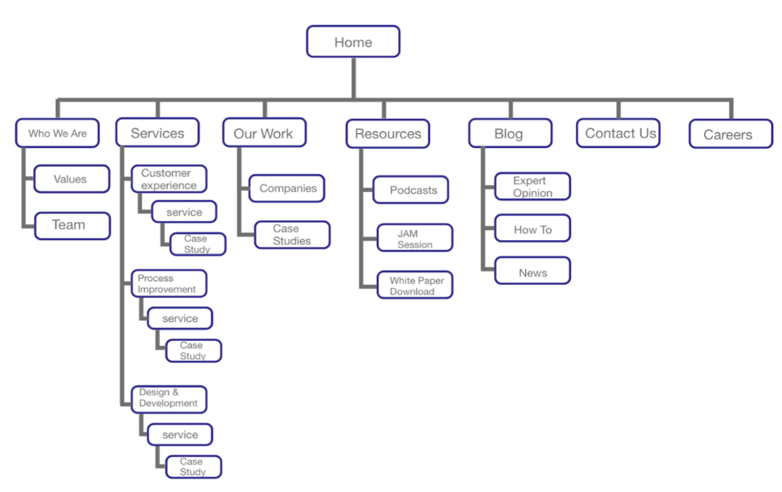
We conducted Open and Closed Card Sorting
Findings from card sorting.
Participants created a category titled “Blog” instead of “Insights” Majority of the participants created subcategories for “Blog” category. Participants added a new category titled “Resources”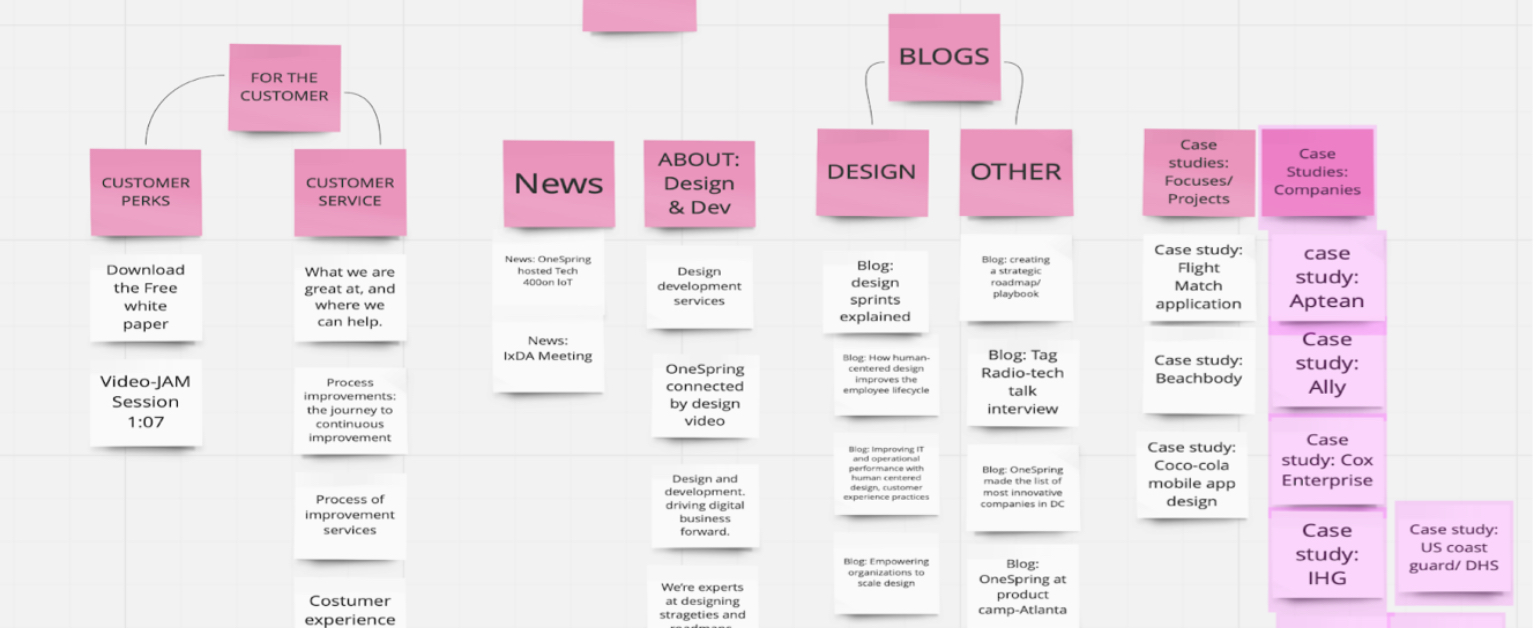
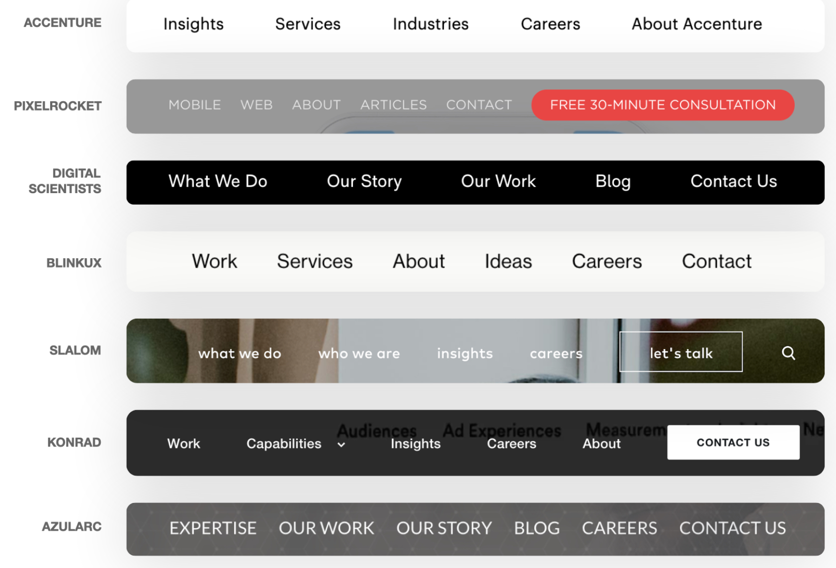
Analyzing the global navigation of competing firms
We performed a competitive analysis of 22 competing UX firms of various sizes, and the first thing we looked at was how they structured their information architecture.
Key Findings
Sites offer extra pages for media and downloads. Competitors include subcategories for blogs.
After cardsorting, analyzing the research from our competitive analysis, and creating a sitemap, we decided the global navigation should look like this.

Designing a flow for our key users that would promote discovery and engagement
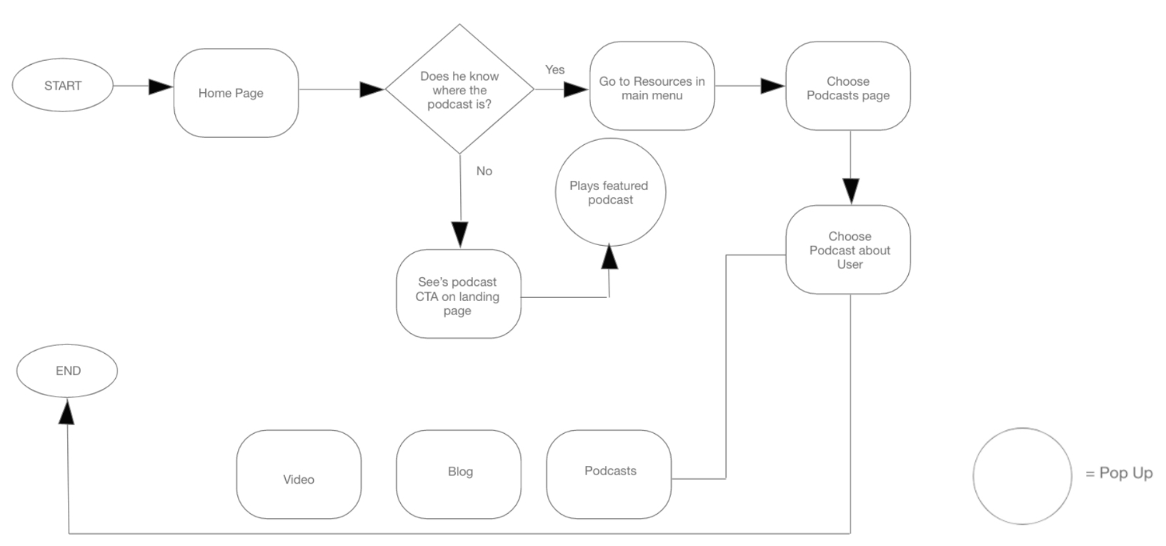
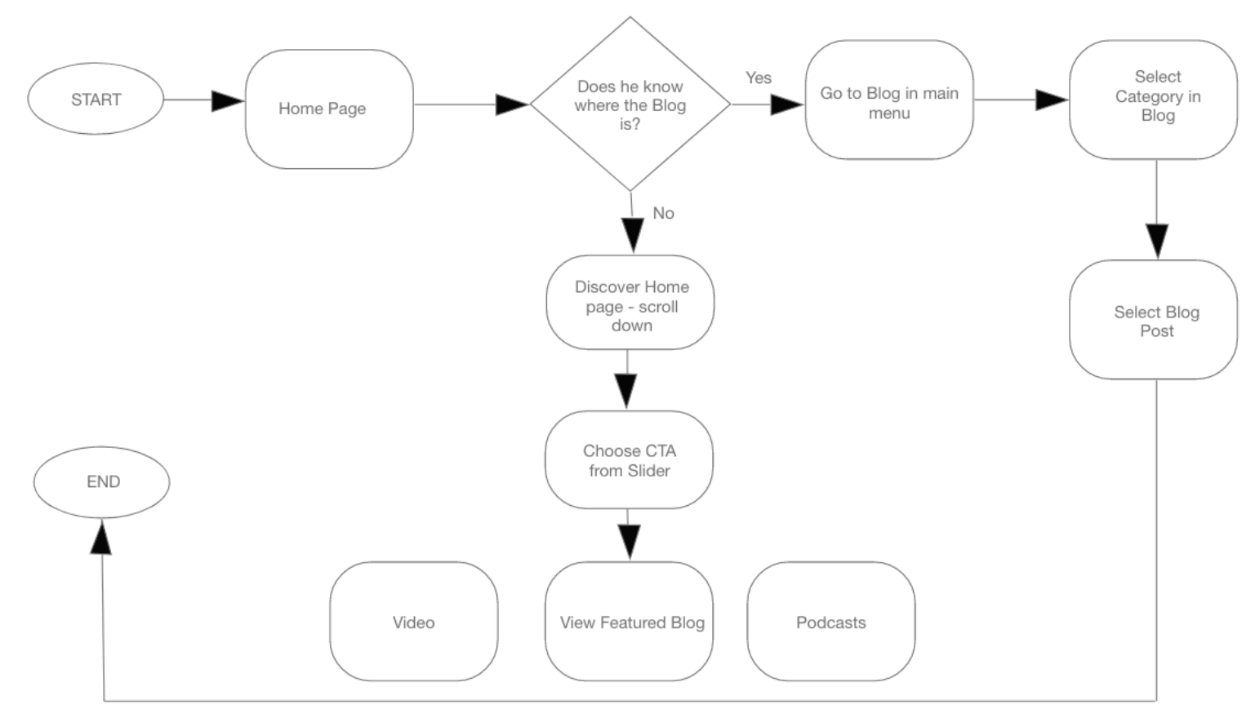
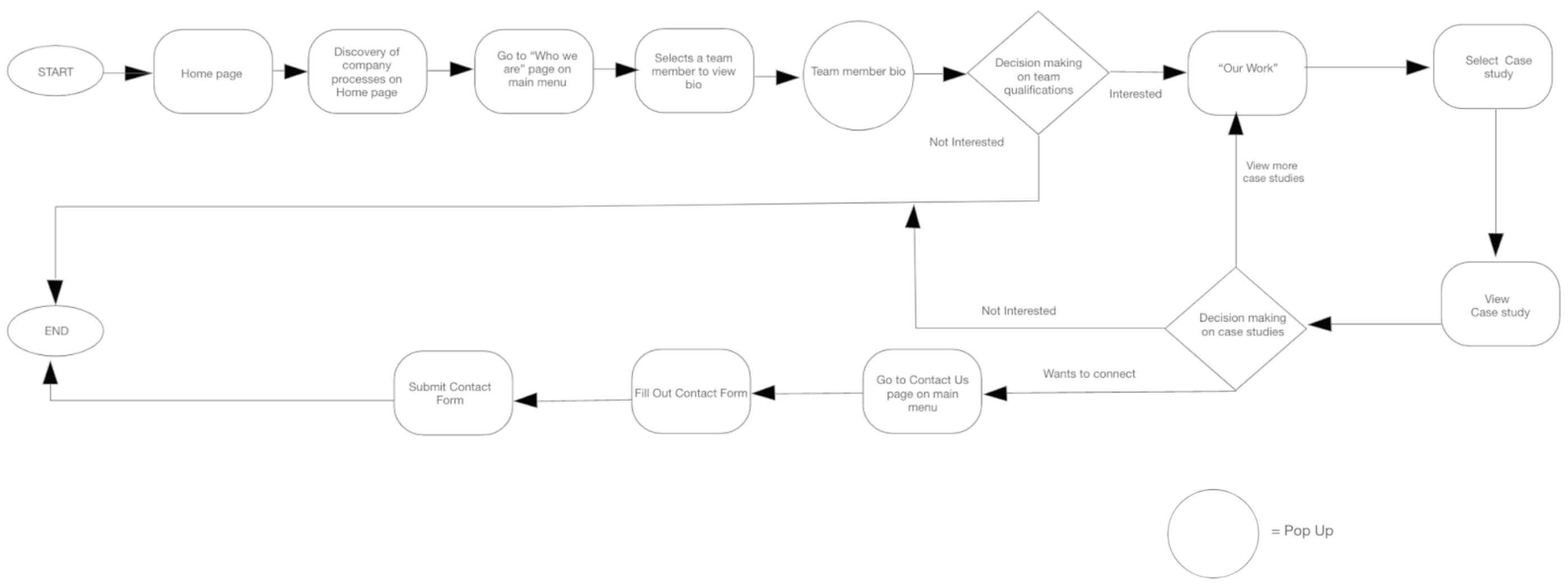
We Created 3 task flows to make sure our designs had a functional and thoughtful blueprint.
The 3 tasks we focused on are:
- A client reviewing OneSpring’s team bio page, viewing case studies, and contacting OneSpring.
- The process a user goes through to find a blog.
- The process a designer takes to find a podcast.
Client’s tasks: viewing “Who we are” “Our Work” “Contact Us”
Finding a Blog
Finding a Podcast
My Projects
Showcase of my recent work
