One Spring: Re-Design
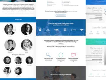
Redesign site for UX agency
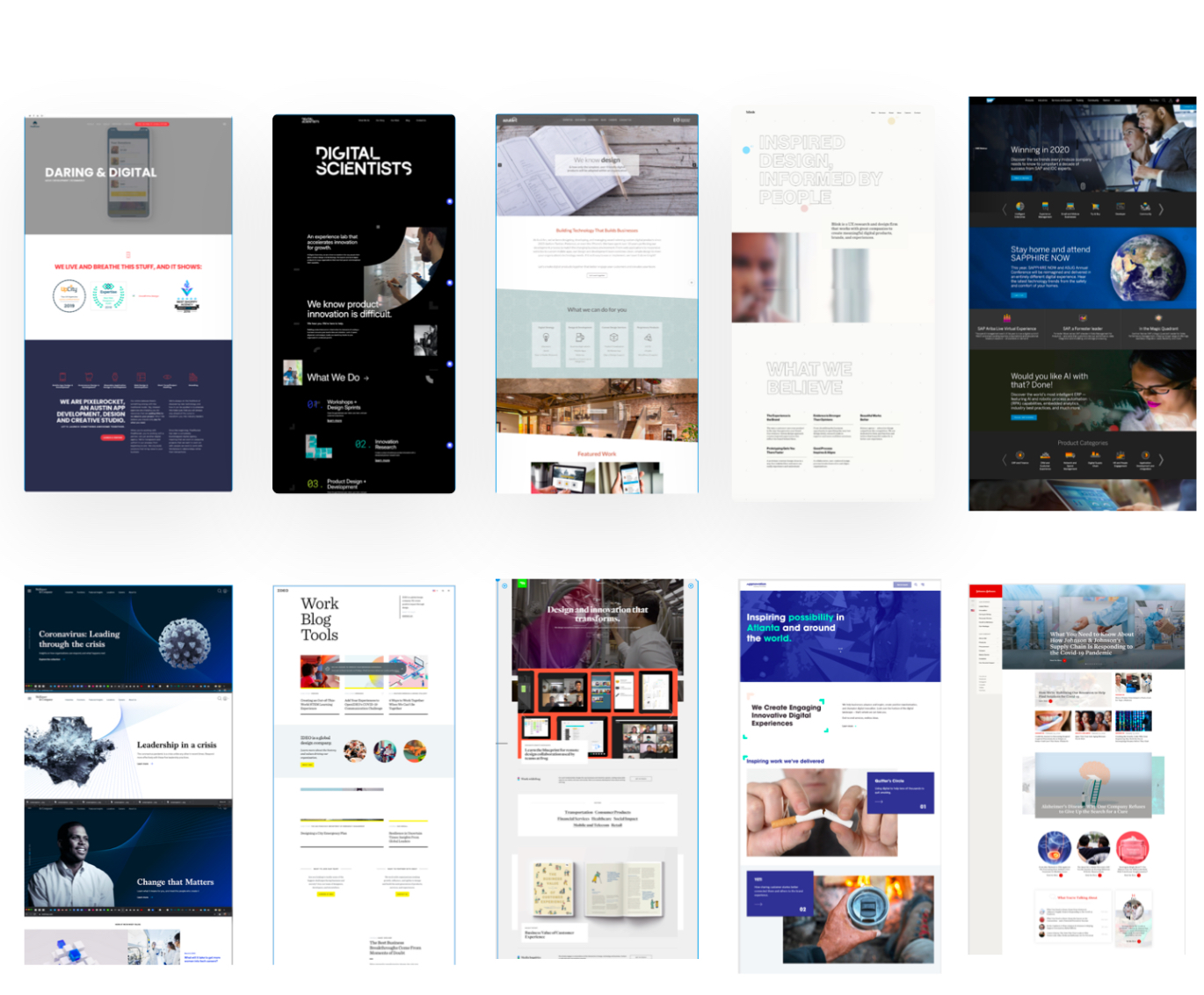
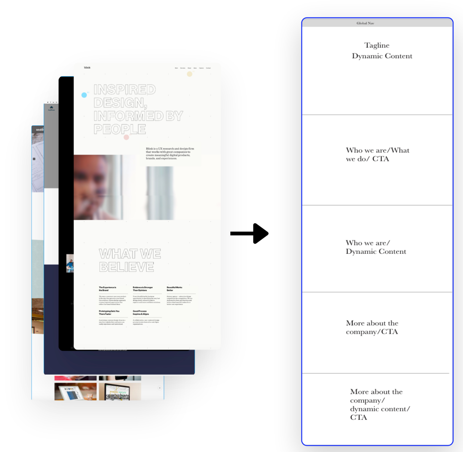
In order to narrow it down, we chose 9 companies with more similar positioning to OneSpring
This Layout came from synthesizing our competitive analysis to see the average of how these competitors laid out their home page content.
Next, We conducted a Design Studio to present three home page variations to OneSpring.
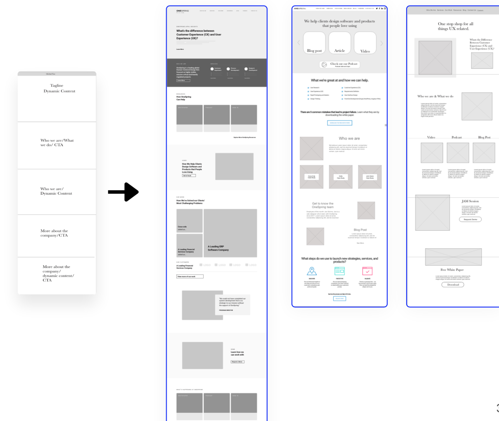
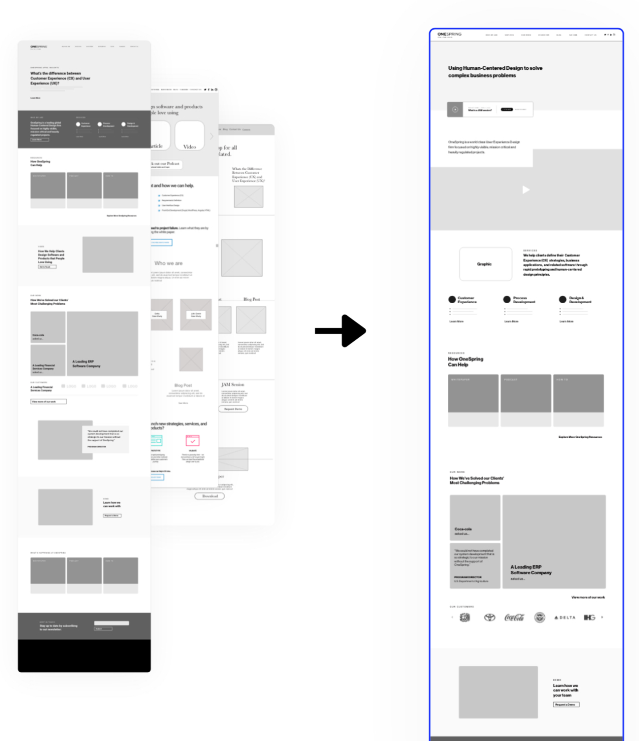
Designing for OneSpring’s Needs and Future
After a mid project meeting with the stakeholders and designers at OneSpring we got a clearer idea of what is important to the company and what they are planning for the future.
After a mid project meeting with the stakeholders and designers at OneSpring we got a clearer idea of what Discovering this, our designs pivoted and our first iterations began.
When looking at ways to mock up the home page, we…
Usability testing
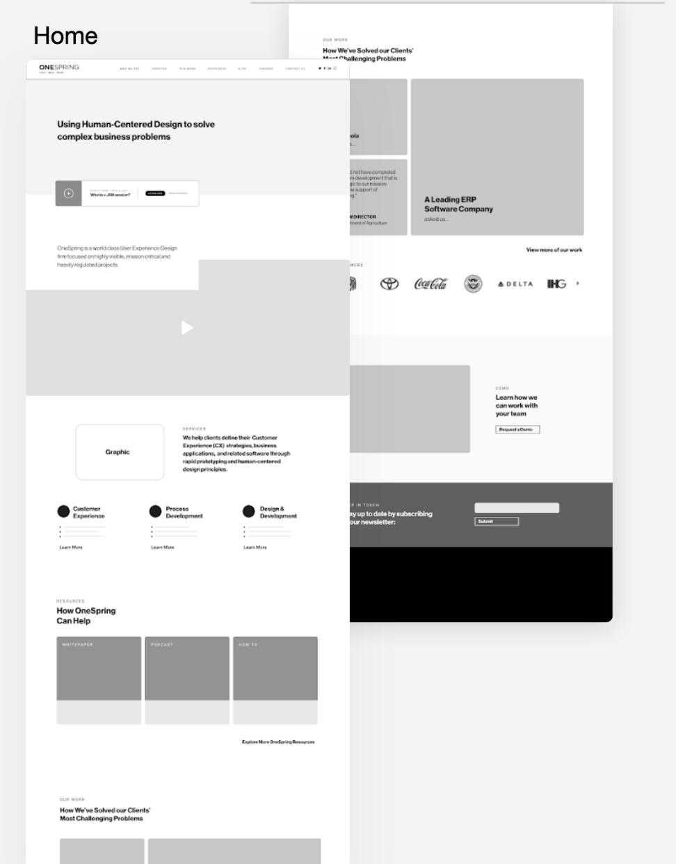
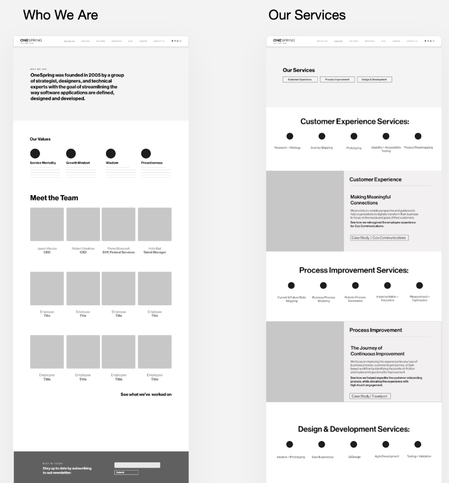
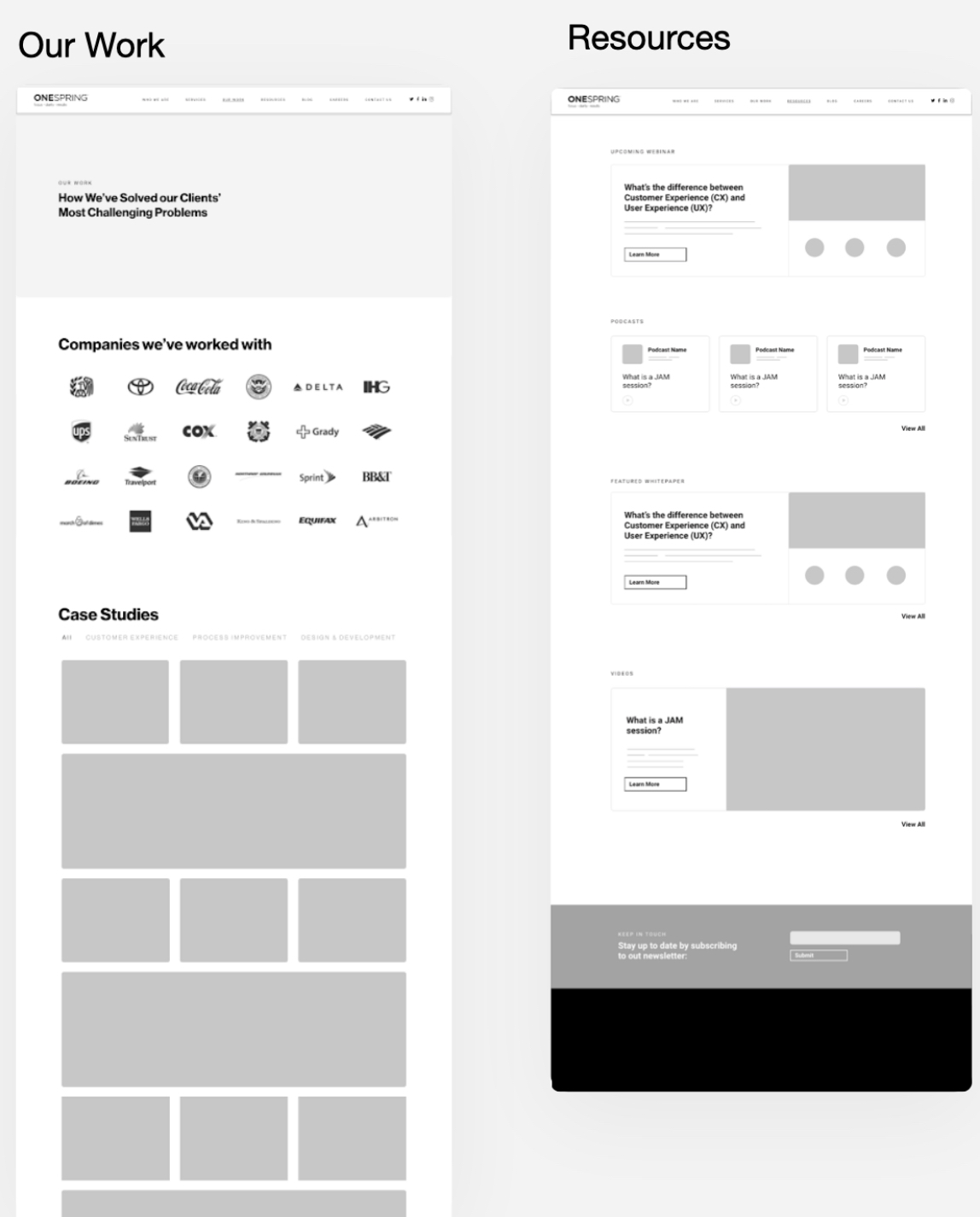
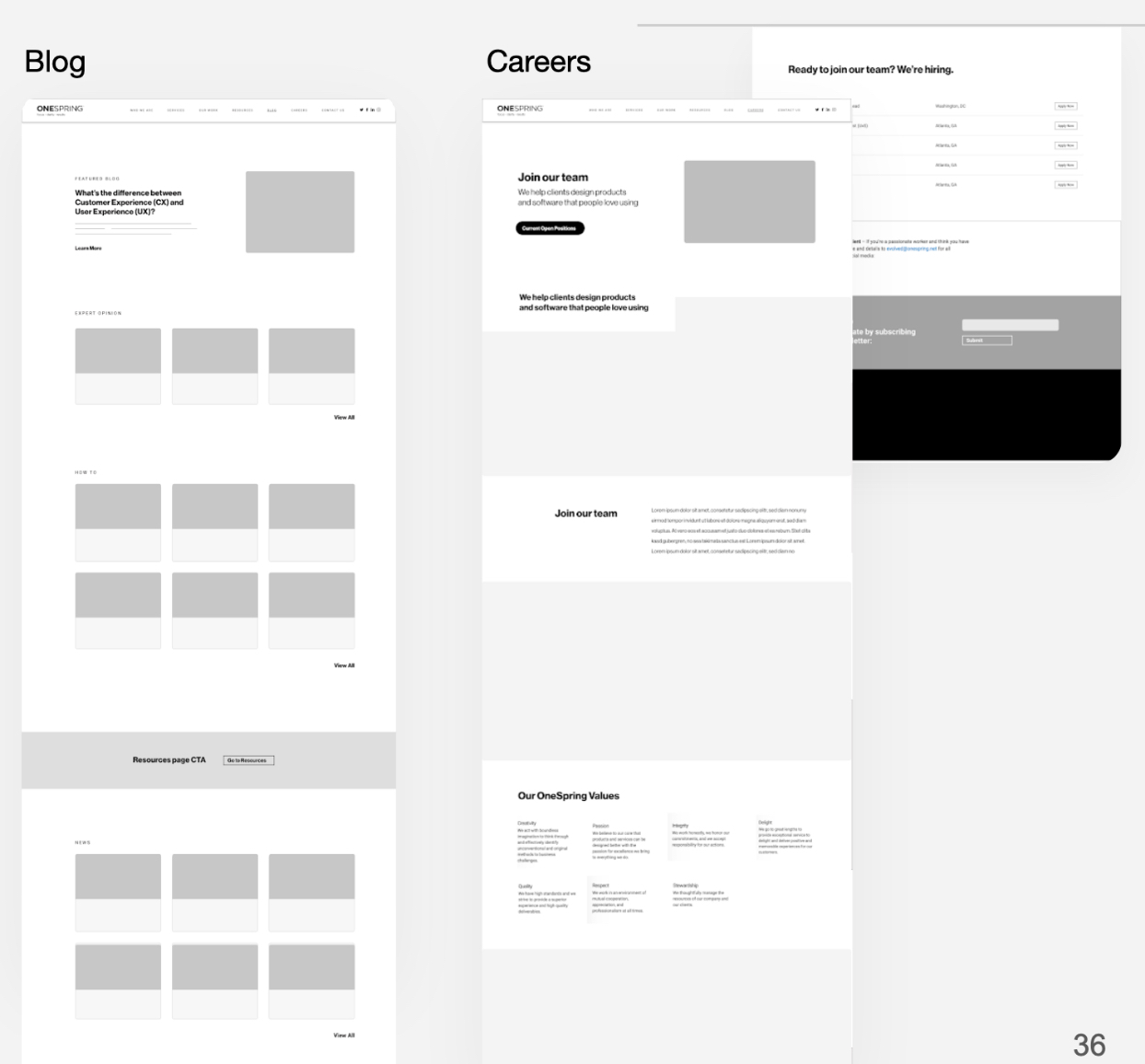
After the initial wireframing was completed we conducted 4 usability tests to ensure that users were able to easily navigate the site and accomplish tasks.
All users were able to complete the tasks without issue.
Users did have some questions or suggestions which led to…
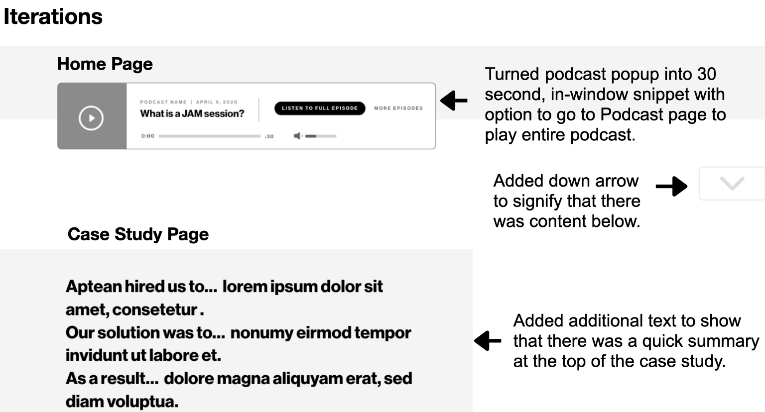
When looking at ways to mock up the home page, our ultimate goal was to pinpoint the disconnect between what users perceived about OneSpring vs how the OneSpring team viewed their company culture, mission, and overall value to the client.
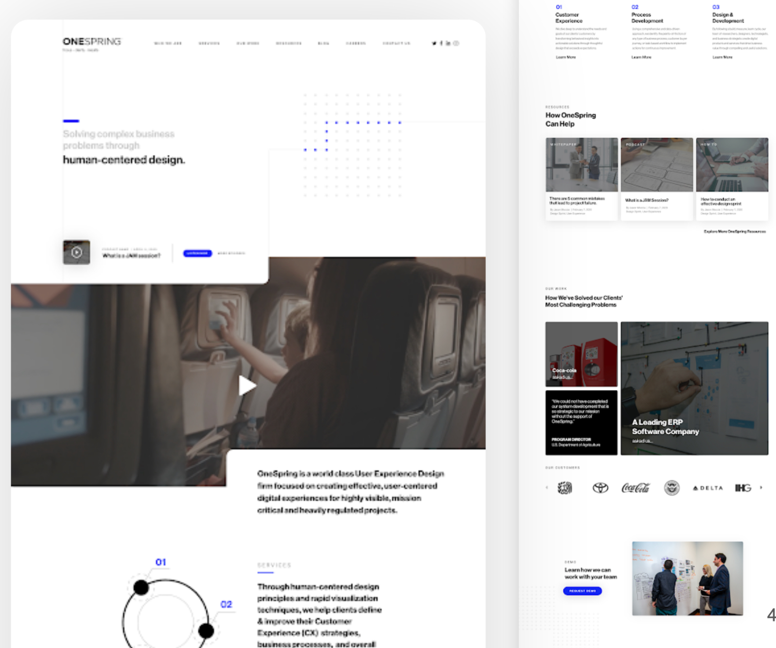
Mock up 1
User Feedback
Style:
- It’s nice and clean
- Feels easy to navigate
- There seems to be some unused real estate
- The font looks professional
What kind of company?
- They seem very open
- It’s highly design oriented
- Youthful
- Highly educated in the sense that everything is laid out very cleanly
- It looks like a fun company
- They look qualified
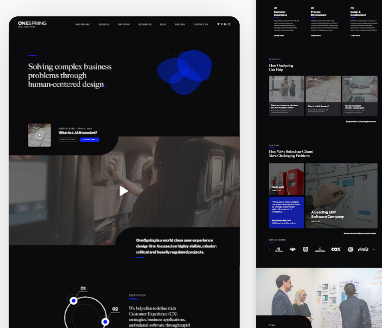
Mock up 2
User Feedback
Style:
- It’s very cool
- It’s bold
- I like the abstract graphic, it seems like it fits
- It’s a little intimidating
What kind of company?
- It looks a little more design-focused than content generating
- it doesn’t make me think of a content firm
- A little more intimidating and stark than the last mockup.
- It doesn’t look like a consulting firm, it looks more like a media outlet
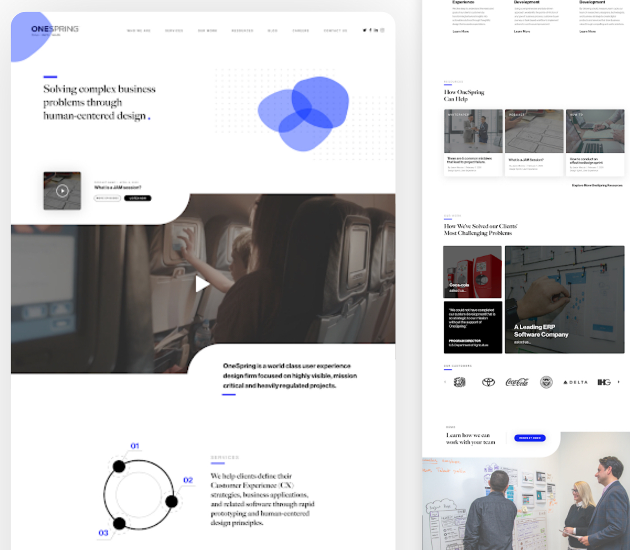
Mock up 3
User Feedback
Style:
- Open
- Clean, but inviting
- Like the graphic element
What kind of company?
- This looks like they do more than just design nice things, which I like because as a customer, I would need them to solve my problem, not just give me a cool looking logo.
- makes me think of an engineering company or a content company.
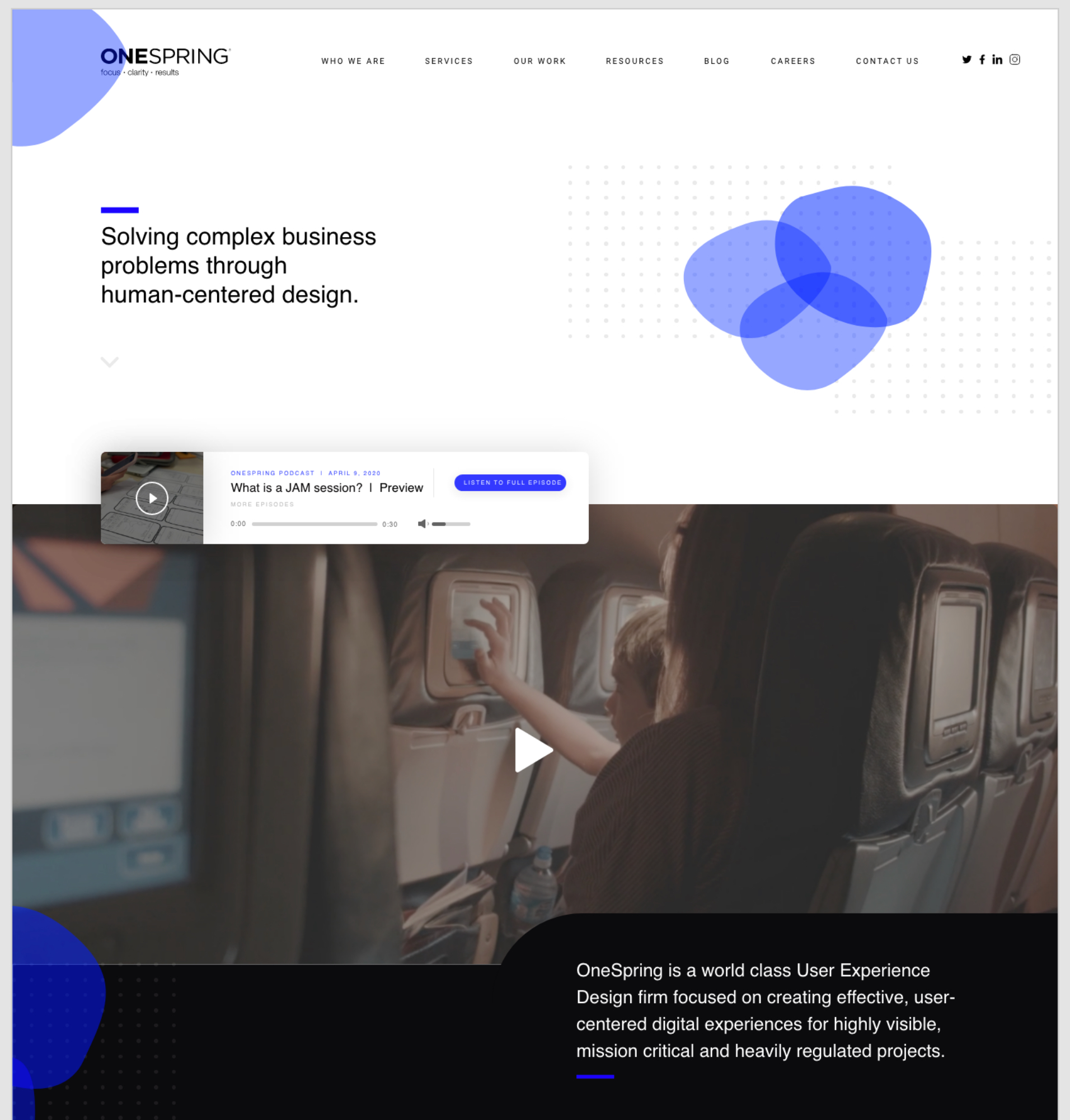
Mock up final
- Updated Iteration Based on User Feedback
- Minimal Style + Abstract Elements & Sans-Serif Text
Inspiration:
- Blink UX
- Design Elements from OneSpring Designer

Immediate: We will be sharing this presentation, which includes all supporting documents, adobe XD files, etc. in the appendix.
Create a landing page for traffic coming from webinar links.
Validate design decisions with primary users.
Once iterated based on your feedback & pushed off to development, monitor engagement via google analytics.
Work with marketing specialists and content strategists to effectively position OneSpring as thought leaders through web content.
Thank you !
My Projects
Showcase of my recent work
