UX Design in WordPress
User Experience refers to how an individual engages with a product, service, or software.
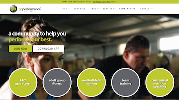
GoPerformance & Fitness Peachtree City
Website: https://goperformanceptc.com/

Project Goal:
Build a website to increase brand awareness and help our clients advertise their mobile application, promote memberships and programs, blog, and videos
My Role:
- Conduct user research and identify user's needs and motivations. Lead the UX Design process.
- Work closely with client’s marketing department teams and be a part of our development team.
Timeline:
March 2023 - May 2023
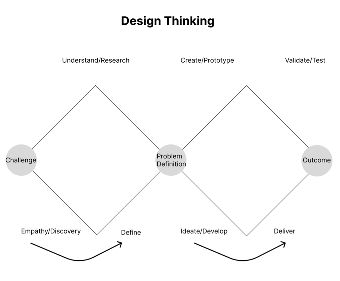
- 01 Requirement Gathering & Research
During this phase, we gathered requirements and identified product and business goals.
- 02 Information Architecture & User Flows
Outline main features and critical screens, created user journey flows and IA.
- 03 Wireframing & Testing
Created quick wireframes in Figma and started testing them internally.
- 04 Design a Solution
I created a database, technical WP environment, menu, style settings, and site main pages using a WP template.
- 05 Product Implementation & Testing
Once our team built the product, we tested and maintained it for additional improvements.
GoPerformance & Fitness Peachtree City is a fitness club Lane, and Payden Montgomery founded.
Client’s philosophy: They believe that fitness should be fun for adults, with scientifically based programming to help people get more robust, reduce their risk of injury, and look their best.
Our clients offer various programs and classes for all fitness levels and ages. Combined with 24/7 access, they make it easy and enjoyable to reach any fitness goals.
GoPerformance & Fitness company is focused on the local community. I identified three groups of their audience:
- Adults
- Students (middle, high school or college)
- Teams
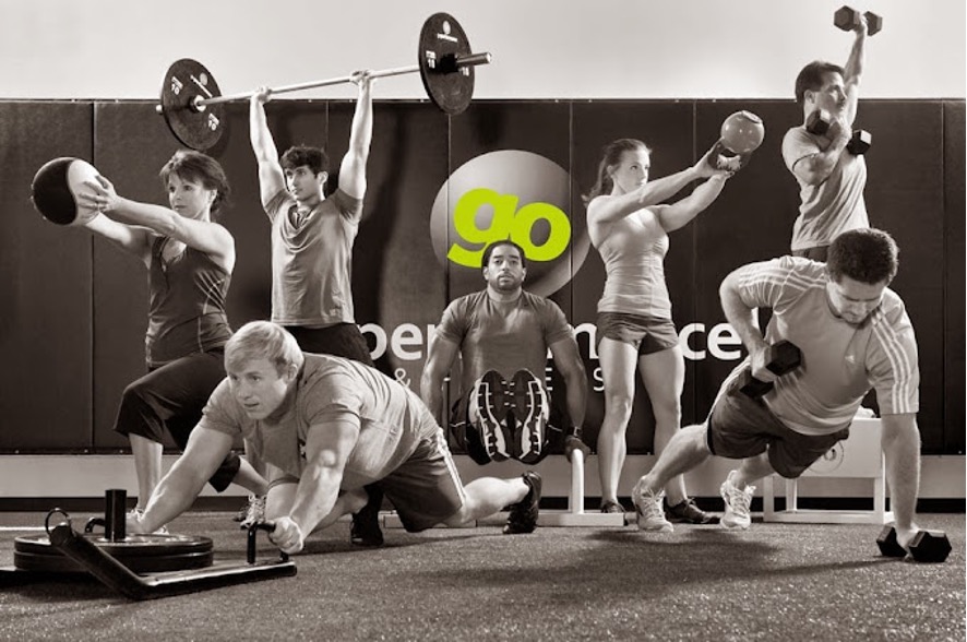
The GoPerformance & Fitness company has a mobile application, but they would like it to be downloaded more often. Also, our client wants to increase brand awareness and sell more memberships.
They are designing an engaging and user-friendly website for a GoPerformance & Fitness club to complement their existing mobile app and cater to adult users, students, and teams.
Our client, the fitness club owners, have approached our agency to develop a website that will enhance their online presence and complement their existing mobile app. The primary goal is to create a user-friendly platform that caters to their target audience, which includes adults, students, and teams. The website should effectively showcase the club offerings, promote membership, and provide valuable information and features that encourage engagement and participation.
Mobile App
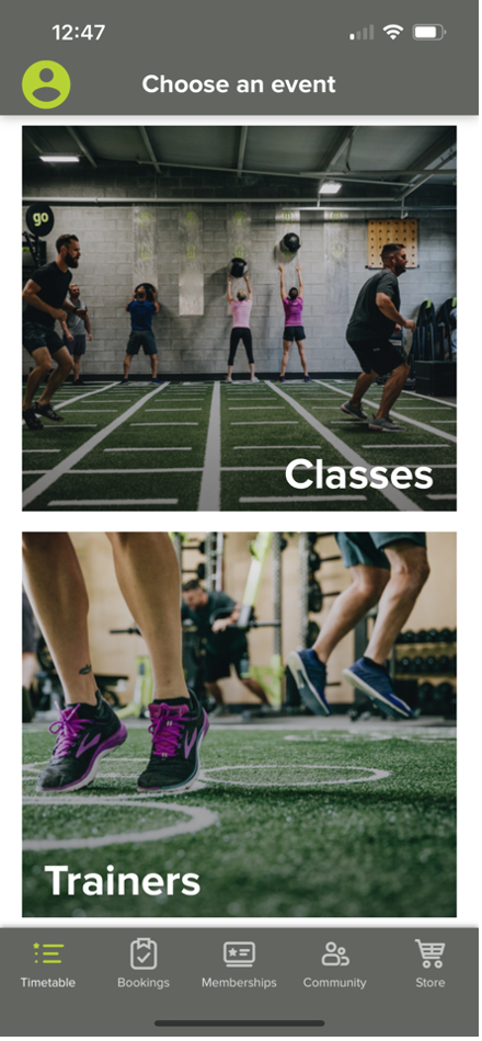
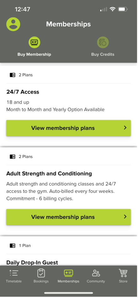
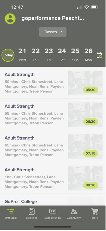
- User-Friendly Interface: Designing an intuitive and easy-to-use interface is crucial to ensure a positive user experience. The website should enable visitors to quickly find relevant information about classes, trainers, schedules, membership options, and other essential details related to the fitness club services. Straightforward navigation and well-organized content will be pivotal to achieving this goal.
- Engaging Visuals and Content: To captivate the target audience and drive engagement, the website must incorporate compelling visuals, such as high-quality images and videos showcasing the fitness club facilities, classes, and achievements. Additionally, the content should be concise, persuasive, and effectively communicate the benefits of joining the club.
- Audience Segmentation: The website must address the needs of three distinct user groups: adults, students, and teams. Each segment may have unique requirements and preferences, such as tailored information, pricing plans, class schedules, and booking options. Designing appropriate sections and customization options for these different audiences will be crucial to providing a personalized experience.
- Conversion and Membership Promotion: The website should actively promote membership and encourage potential customers to act. Implementing clear calls-to-action (CTAs), streamlined registration processes, and effectively showcasing discounts or incentives will drive conversions and boost the fitness club membership base.
- Responsive Design and Mobile Optimization: Ensuring the website is fully responsive and optimized for mobile devices is essential. As the client already has a mobile app, the website should provide a seamless experience across various devices, allowing users to access the same features and information conveniently, regardless of their preferred platform.
- Integration with Existing Systems: The website should be designed to integrate smoothly with the club existing systems, such as its membership management software, scheduling tools, and other relevant applications. This integration will streamline administrative tasks, enhance operational efficiency, and provide a consistent experience for both staff and users.
I began my process by creating a persona that embodied GoPerformance & Fitness Company's target user.
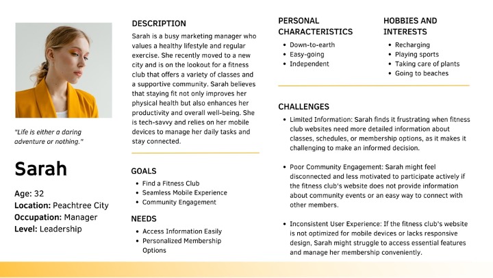
By understanding Sarah's goals, preferences, and pain points, our design process can prioritize creating a website that caters to her needs and enhances her overall experience as a potential fitness club member.
Our process started with the first kick-off meetings with clients, our designers, the marketing team & engineers. We focused on understanding the problem, product, business goals, user needs, goals, and motivations.
- Gathered requirements (product, technical, creative, and user requirements)
- We identified product & business goals with the team.
- Brainstorming on possible solutions
We started with a simple website structure to focus on organizing, structuring, and labeling content effectively and sustainably. We considered the specifics of the target audience's needs and the type of content we have.
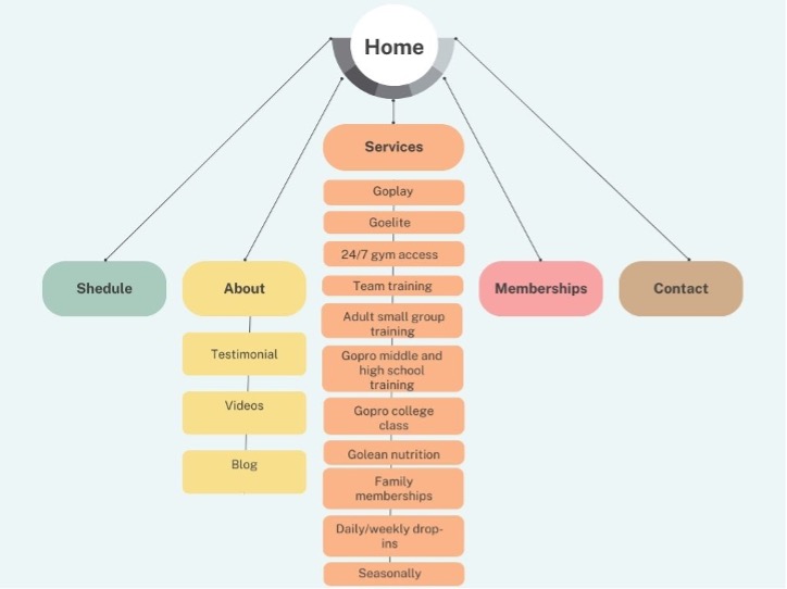
We discussed all aspects with the team to ensure that the wireframes address the user needs and goals, as well as business goals. I started with pen and paper and then moved on to wireframes using Figma.


We started with low-fidelity prototypes because it's the quickest way to get feedback on the preliminary site information architecture, design, and content.
It helped us to gather feedback early in the design process, make changes quickly, and improve initial designs.
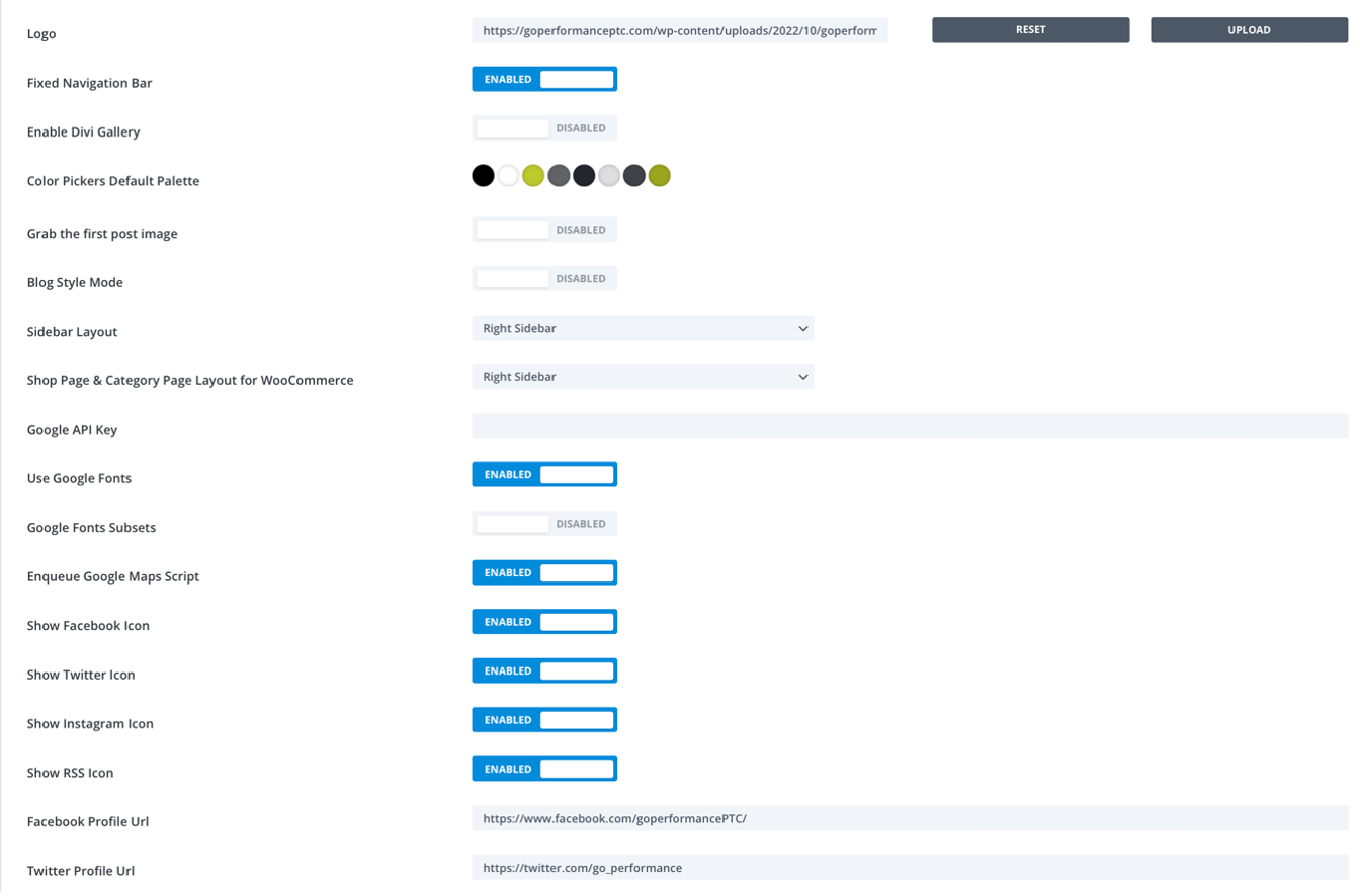
Word Press CMS Style Settings
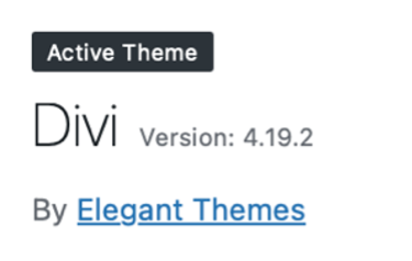
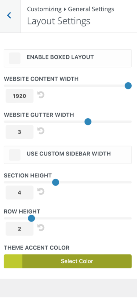
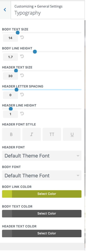
Divi Theme Settings
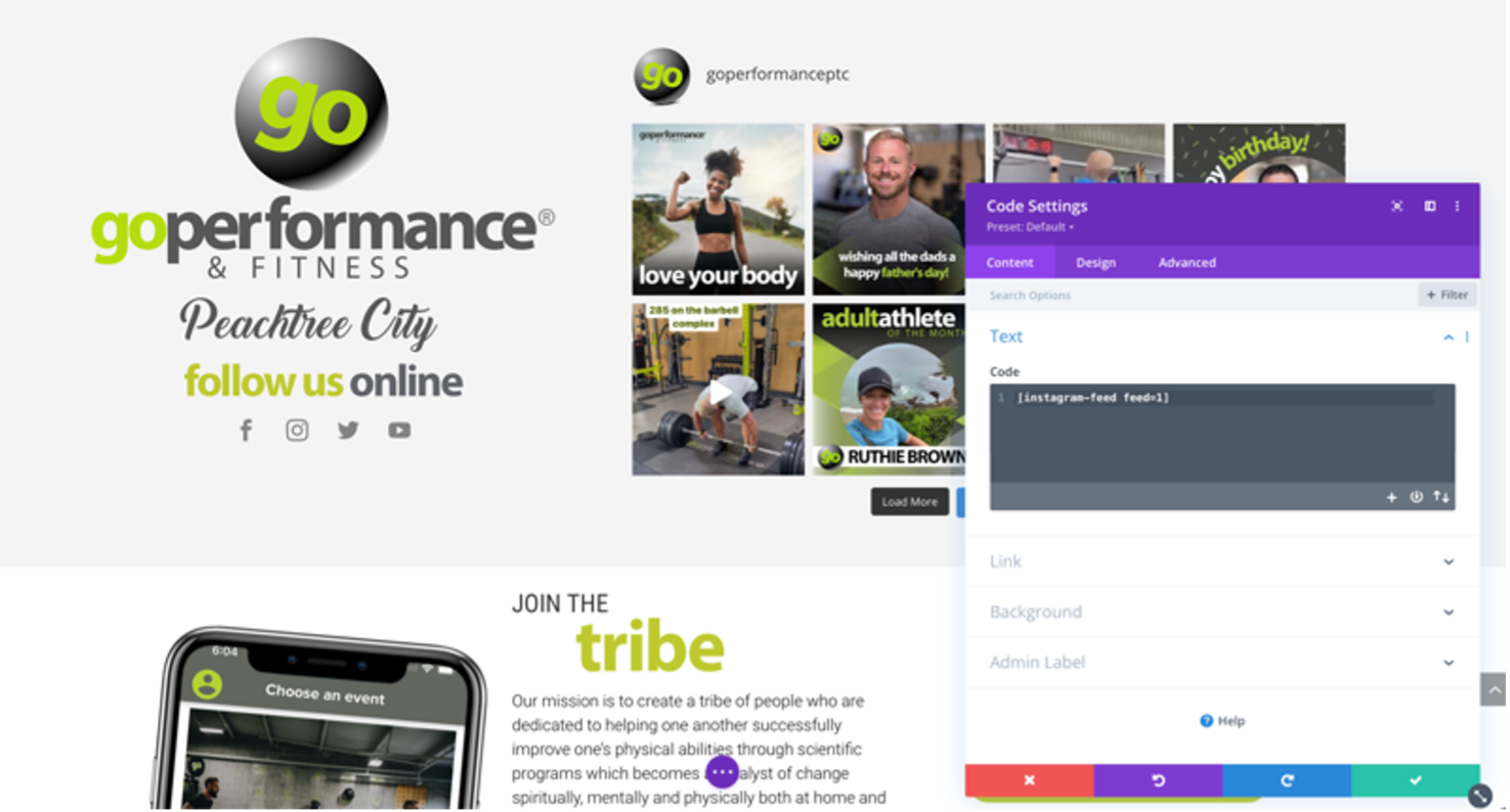
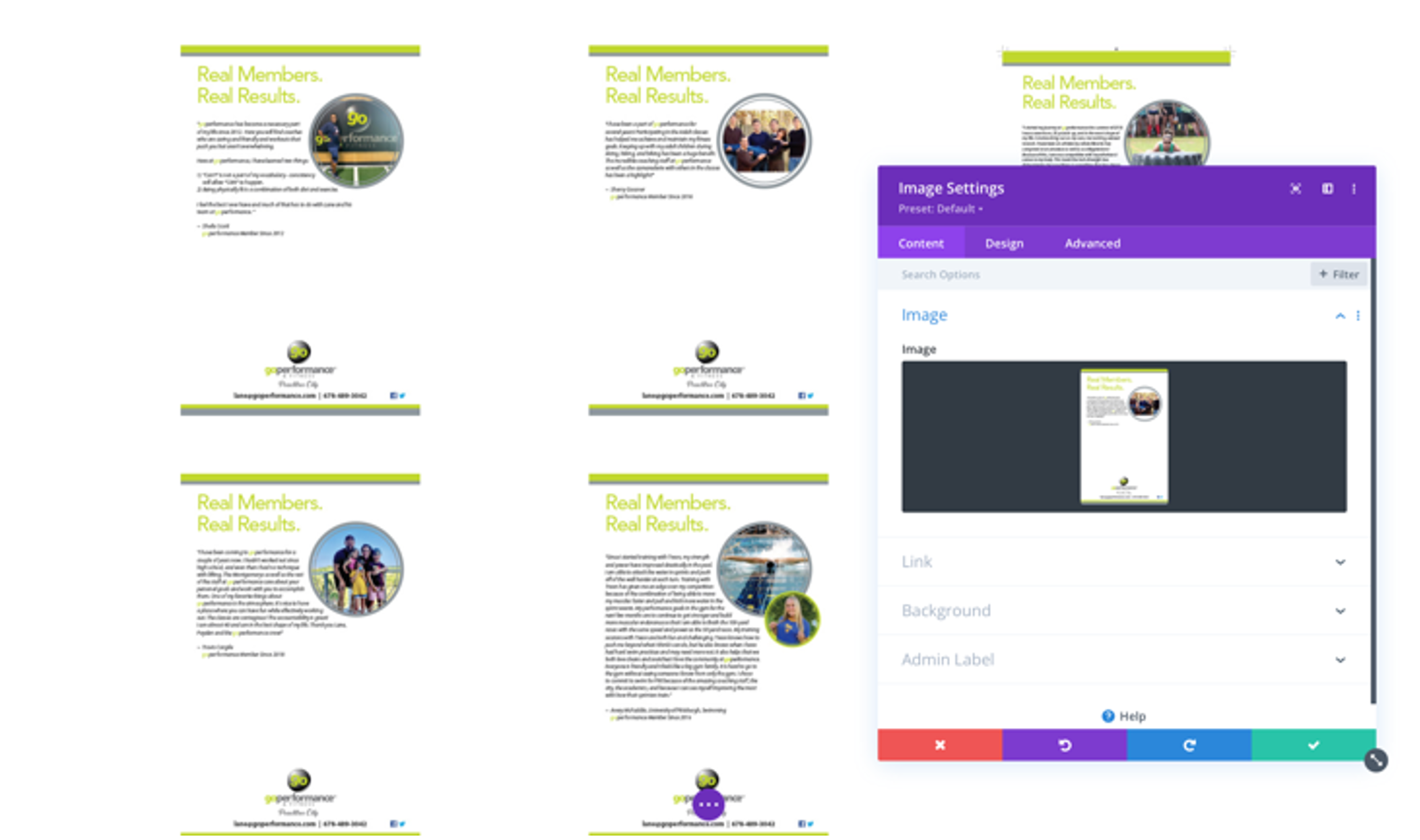
Work with blocks ion WP and customization.
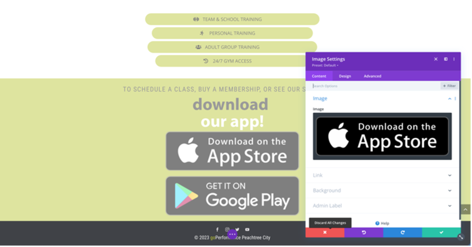
To optimize a WordPress website user experience, it's crucial to know the factors that shape visitors interactions with your platform. With this in mind, here are the primary methods to elevate your WordPress UX:
Responsive Design
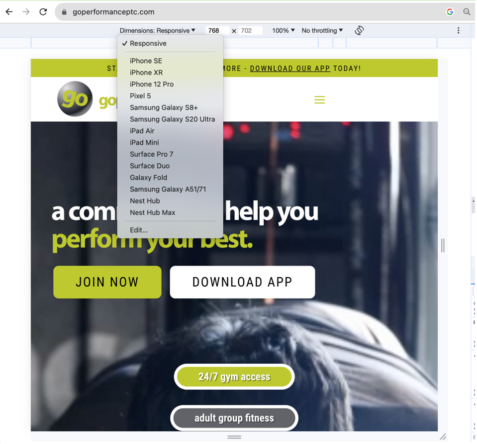
An integral element of superior WordPress UX is maintaining a consistent browsing experience across all devices, known as responsive design. This ensures that your site remains visually appealing on screens of varying sizes.
Your site content should automatically adapt to fit the width of the viewing screen. Achieving this requires optimizing your site layouts for both desktop and mobile. Responsive websites adjust elements like image size, content positioning, font size, and navigation to ensure your site looks and functions well on any device.
Content Design
When considering the content to include on your website, it's important to think about what to write, how to visually present it, and how users will engage with it. Content design is the formal term used to describe the process of making website content usable, accessible, and readable.
Within the realm of content design, ensuring consistency in the appearance of content across web pages is crucial. This involves aligning content with your page layouts, banners, and buttons.
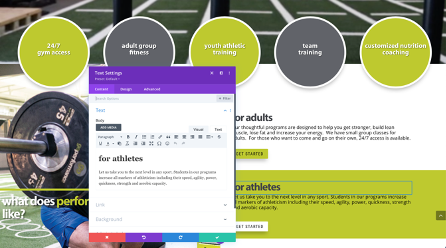
Content designers understand the significance of specific content on a page and aim to present it in the most effective manner. For instance, they may recommend incorporating videos with catchy slogans or interactive tools like calculators to convey information engagingly and in line with the content purpose. They also determine how to make content visually stand out and easily accessible based on its significance and value to site visitors.
Site Speed
Your site design can significantly impact its loading speed. Employ best practices, such as optimizing image loading times, implementing effective pagination, and carefully selecting plugins that won't slow down your site.
The number and type of UX design elements you incorporate also play a role in page loading speed. For example, using obscure fonts and an excess of social media buttons can hamper loading times. In content-rich pages, employing accordion buttons (often styled as "Read More" buttons) or collapsible/expandable product filters in the sidebar can help reduce loading times.
Research shows that when page load speed increases from 1 second to 3 seconds, the probability of users bouncing from your site rises by 32%. In addition to your WordPress UX design, ongoing site maintenance is essential to maintain consistently high performance.
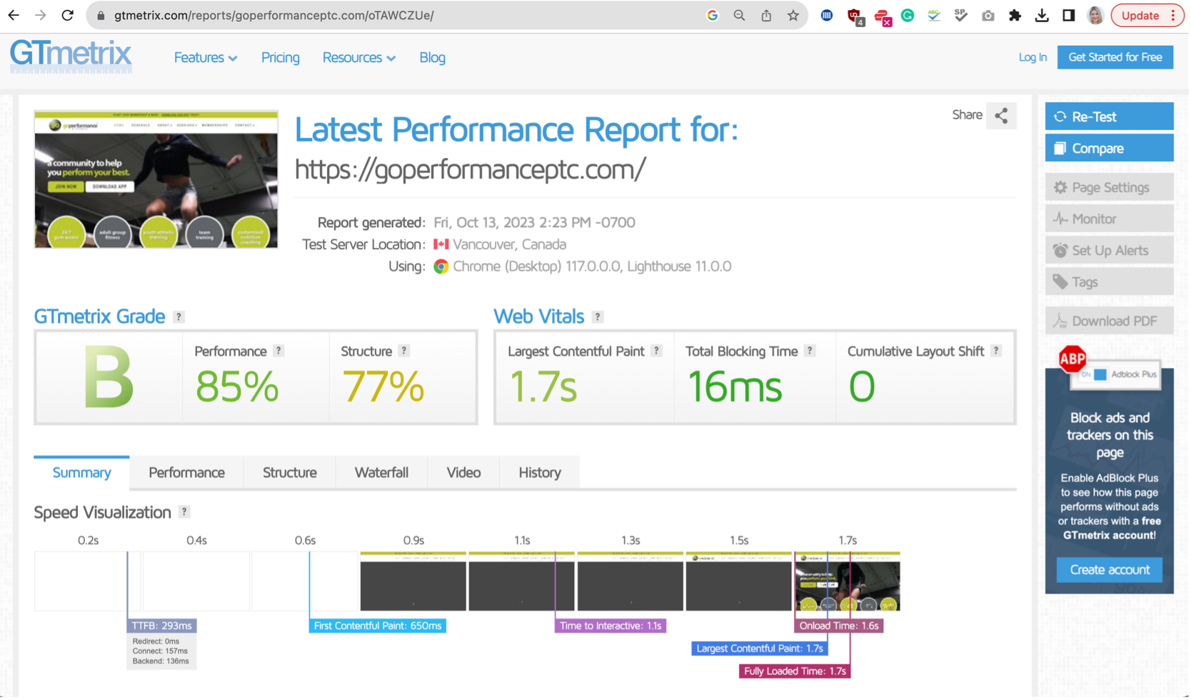
- User engagement improved significantly, and users found it easy to navigate the website, resulting in increased session durations and reduced bounce rates.
- Conversion rates showed a positive trend, with more users exploring membership options.
- Users provided positive feedback, expressing satisfaction with the full service information, intuitive navigation, and the overall user-friendly interface.
- The building of a website showcased the fitness club offerings effectively, leading to an increase in membership inquiries and walk-in visits.

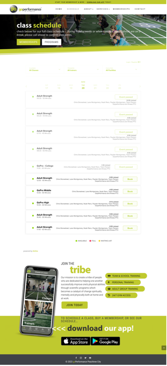

- Continuously monitor user feedback, conduct usability tests, and analyze data to identify ongoing pain points and areas for further improvement.
- Regularly update class schedules, trainer profiles, and membership information to ensure accuracy and relevance.
- Leverage social media integration to promote community engagement, share success stories, and encourage user-generated content.
By conducting user research, creating a website, and continuously analyzing user data, the GoPerformance & Fitness Club improved the user experience, leading to increased engagement, higher conversion rates, and improved customer satisfaction. The UX case study demonstrates the importance of user-centered design principles and the positive impact they can have on the success of a fitness club digital presence.
My Projects
Showcase of my recent work
